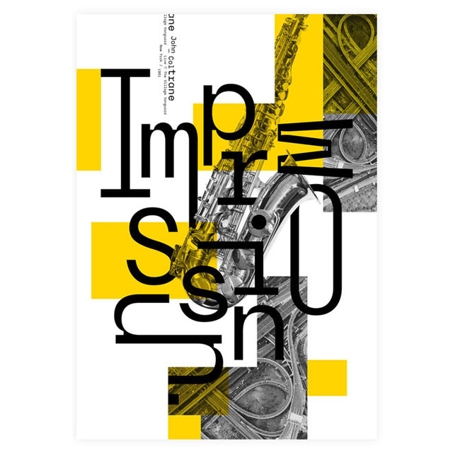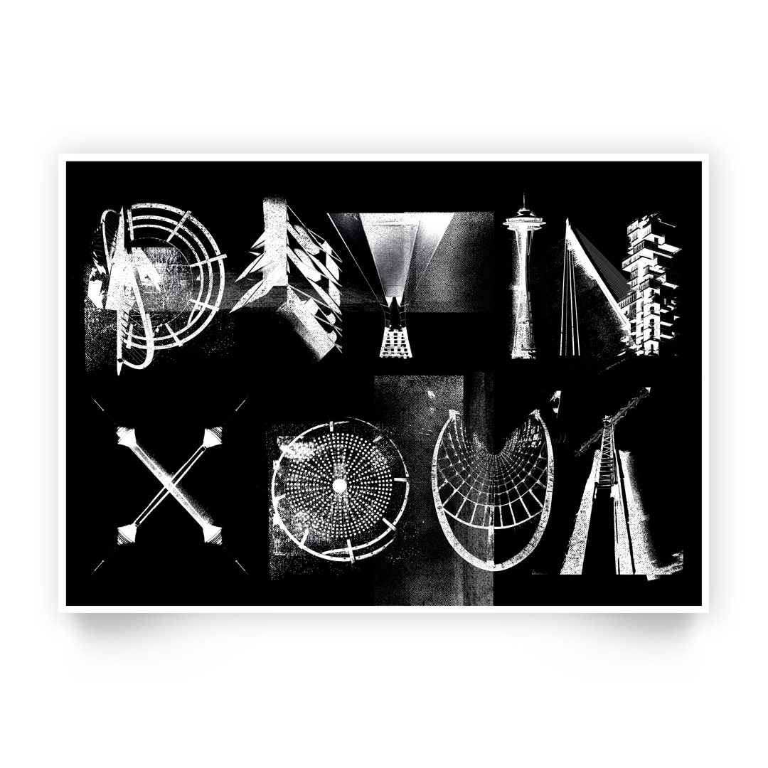
Identite: Design Refresh
Identite is a long-standing series of weekly gigs started in 2010, that needed a design refresh.
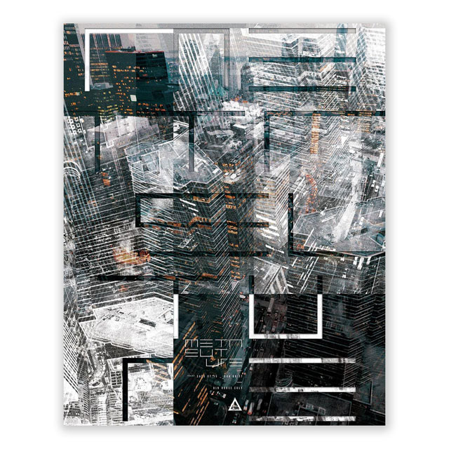
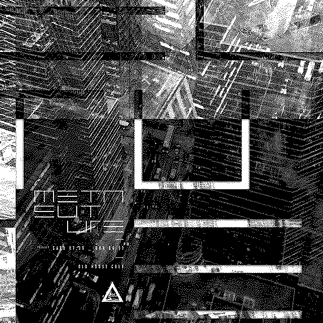
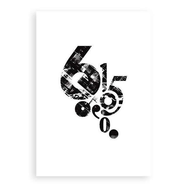
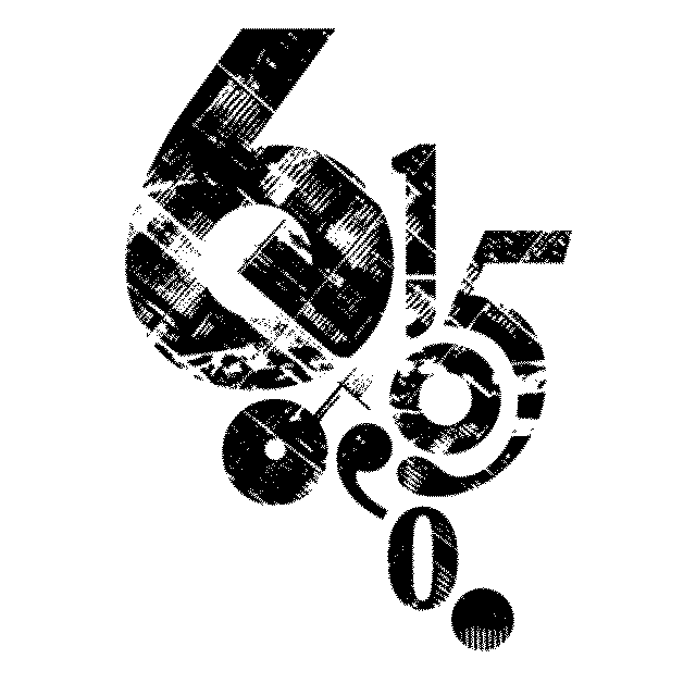
Identite showcases music across all genres. This level of openness and flexibility got me thinking of suggesting elements of modularity in the new design. The logotype is designed with shifting blocks. This represents how Identite is flexible in shifting and growing now only with current musical input, but also future-proofed for artistic endeavours to come.
Since the promotional material will be hosted on socials, it is pivotal to have a motion element. Taking into consideration that the roster will be hosted in a club, influences of cub flyers and graphics come to mind, and I had to pay homage to a time when these flyers carried cultural weight.
Instead of having a fixed identity color, the logotype acts as an open window, taking form of the visual cues curated for the month. This further expands on the concept of modularity and being able to shape-shift. The first iteration focused on the idea fluidity.