Exhibit Identity
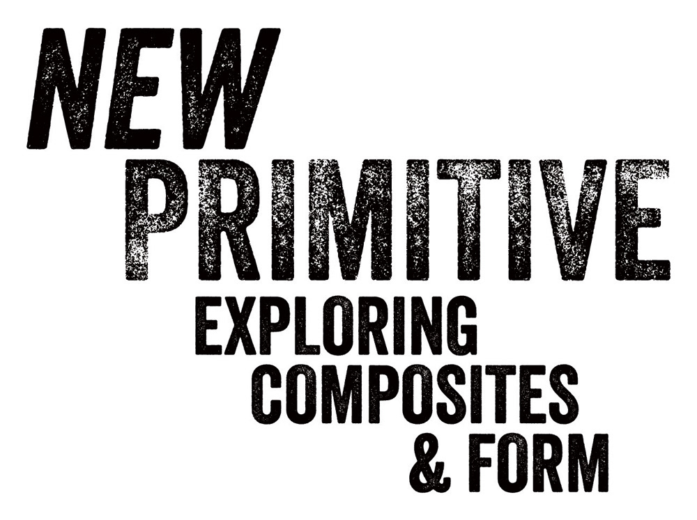
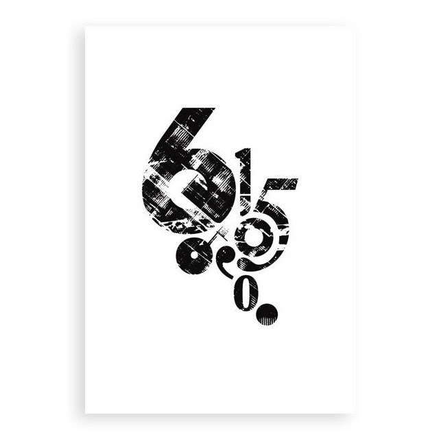
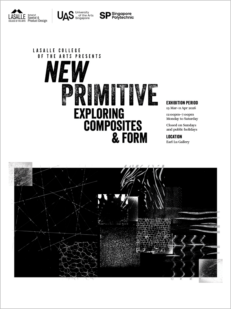
Exhibition logotype
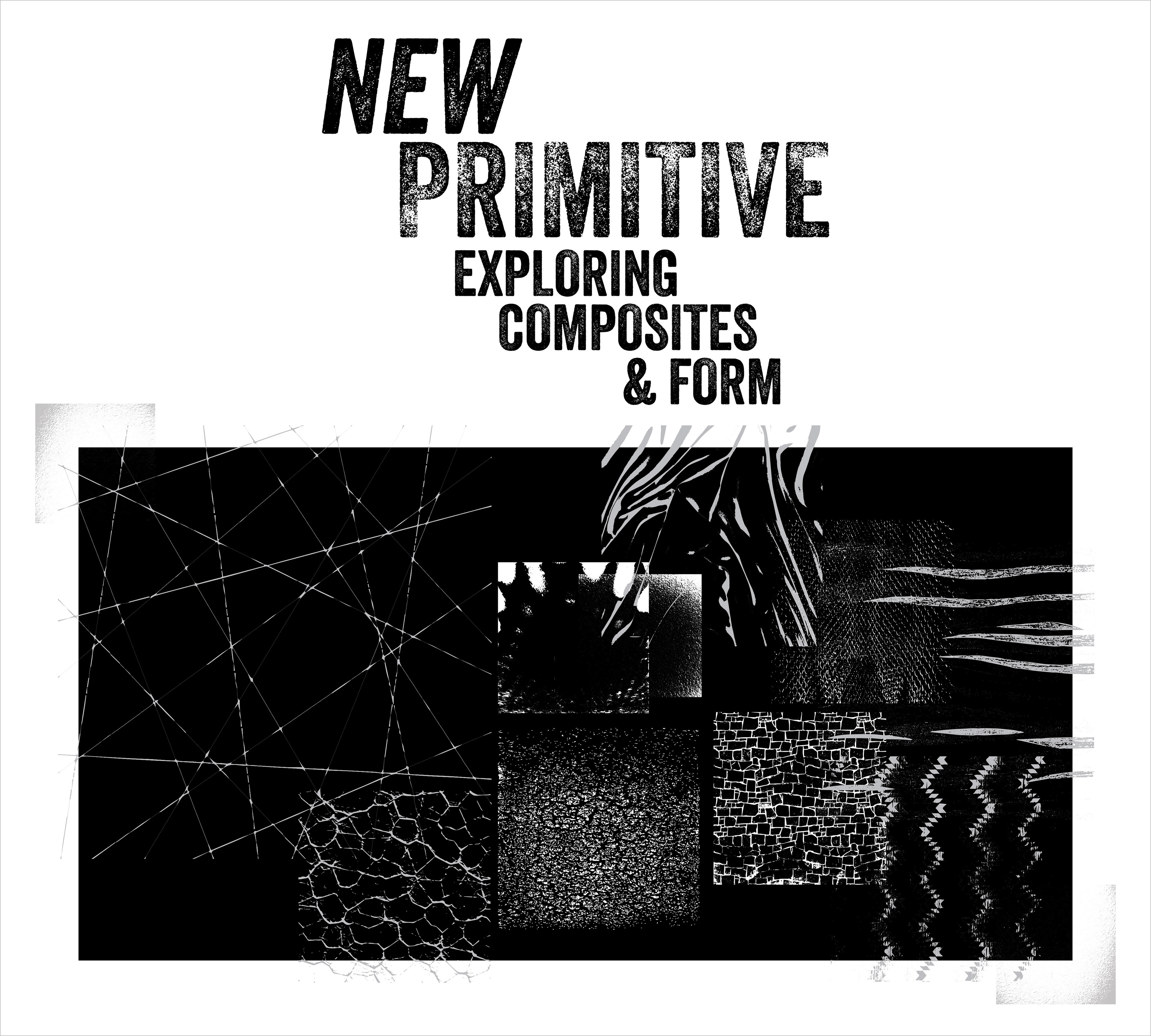
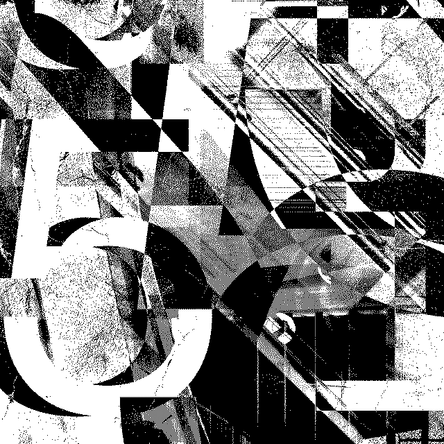
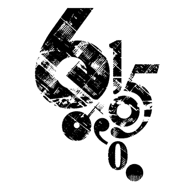
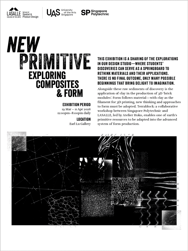
Exhibition key visual
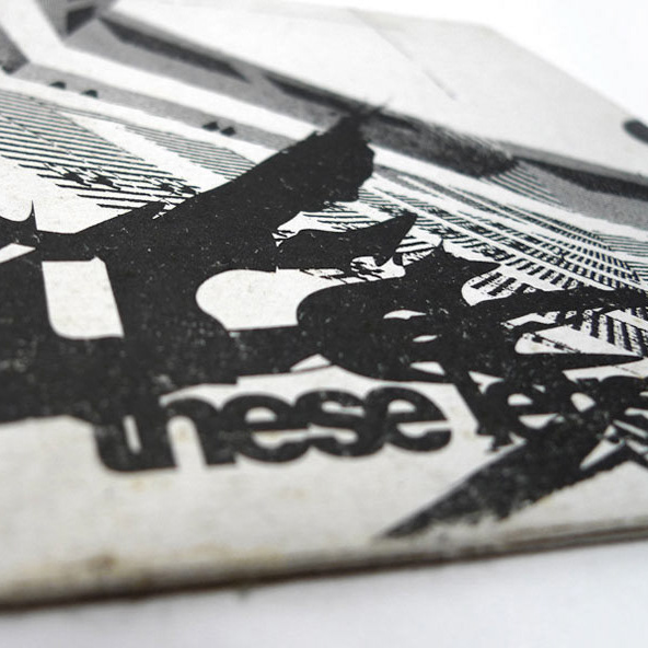
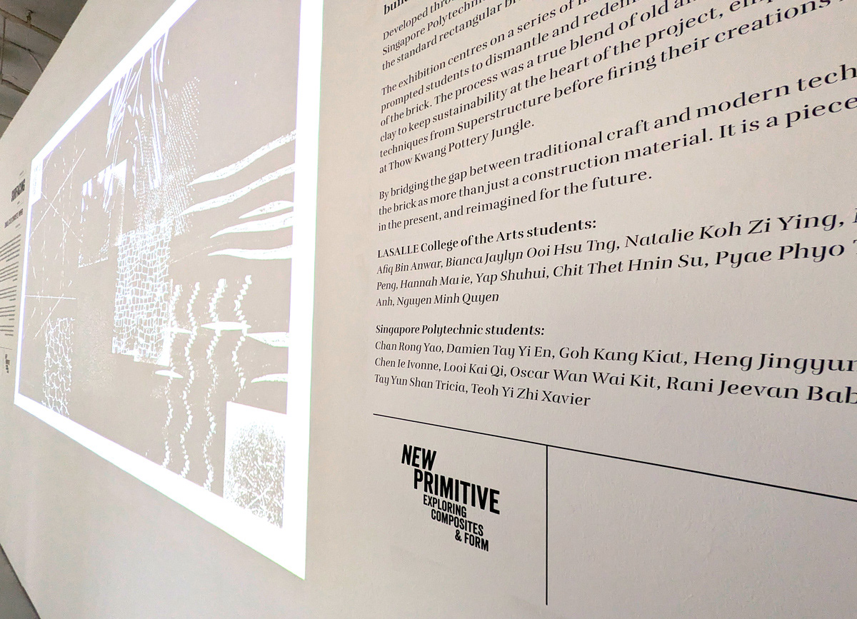
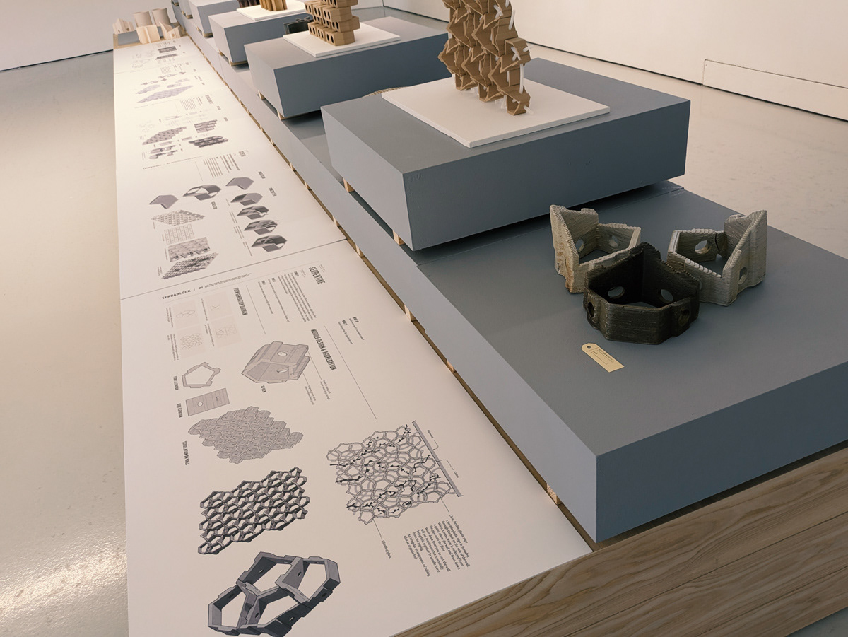
Overview of the exhibit write-up wall and motion centrepiece
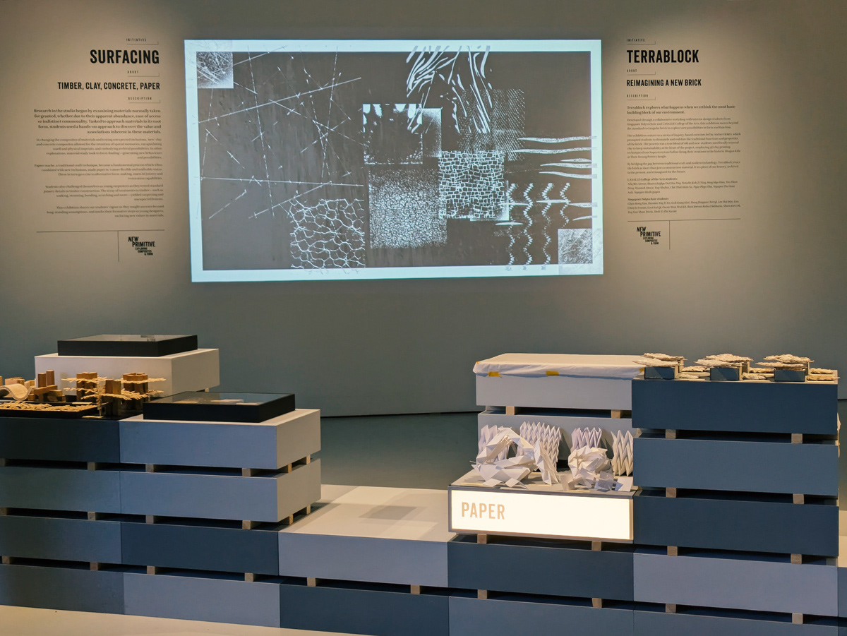
Motion centrepiece details
Wall write-up details
Visual identity adapted for Instagram
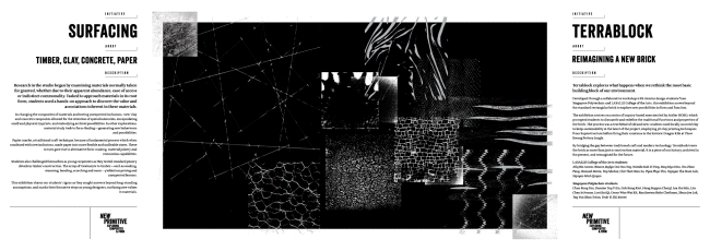
Visual Boards
Labelling Systems
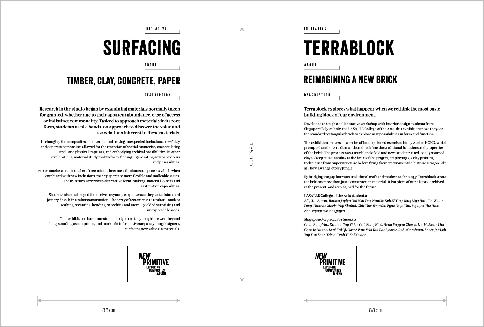
The Brief
New Primitive: Exploring Composites & Form is an exhibition by LASALLE's School of Spatial Design. In a climate of rapid technological change, the exhibition brought into attention primitive acts of making as a means of exploring materiality, process and form. It also showcased the collaborative workshop done with Singapore Polytechnic, Terrablock.
The brief called for a visual language that is seen through an 'unfinished' and gritty lens, with a touch of playful typography.
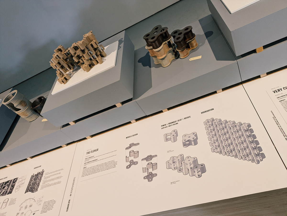
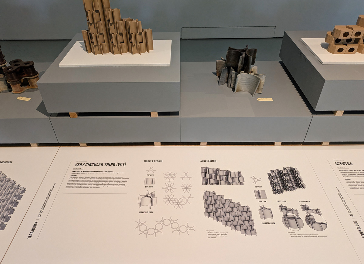
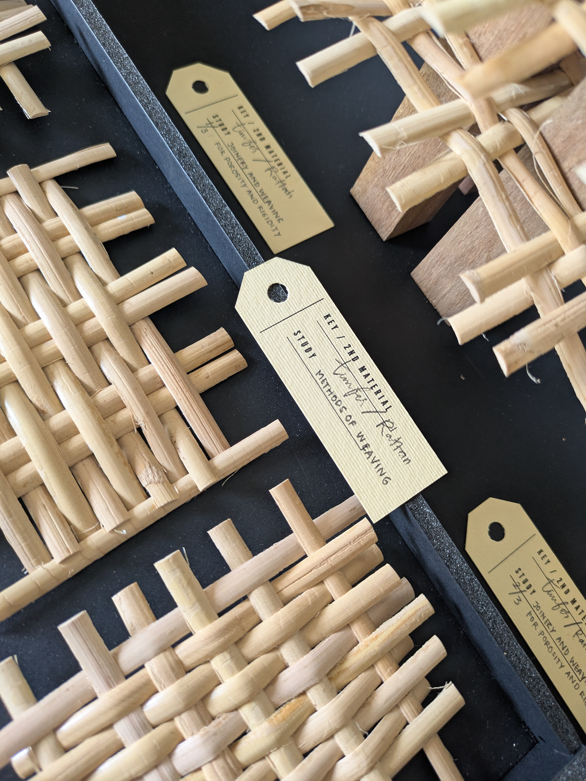
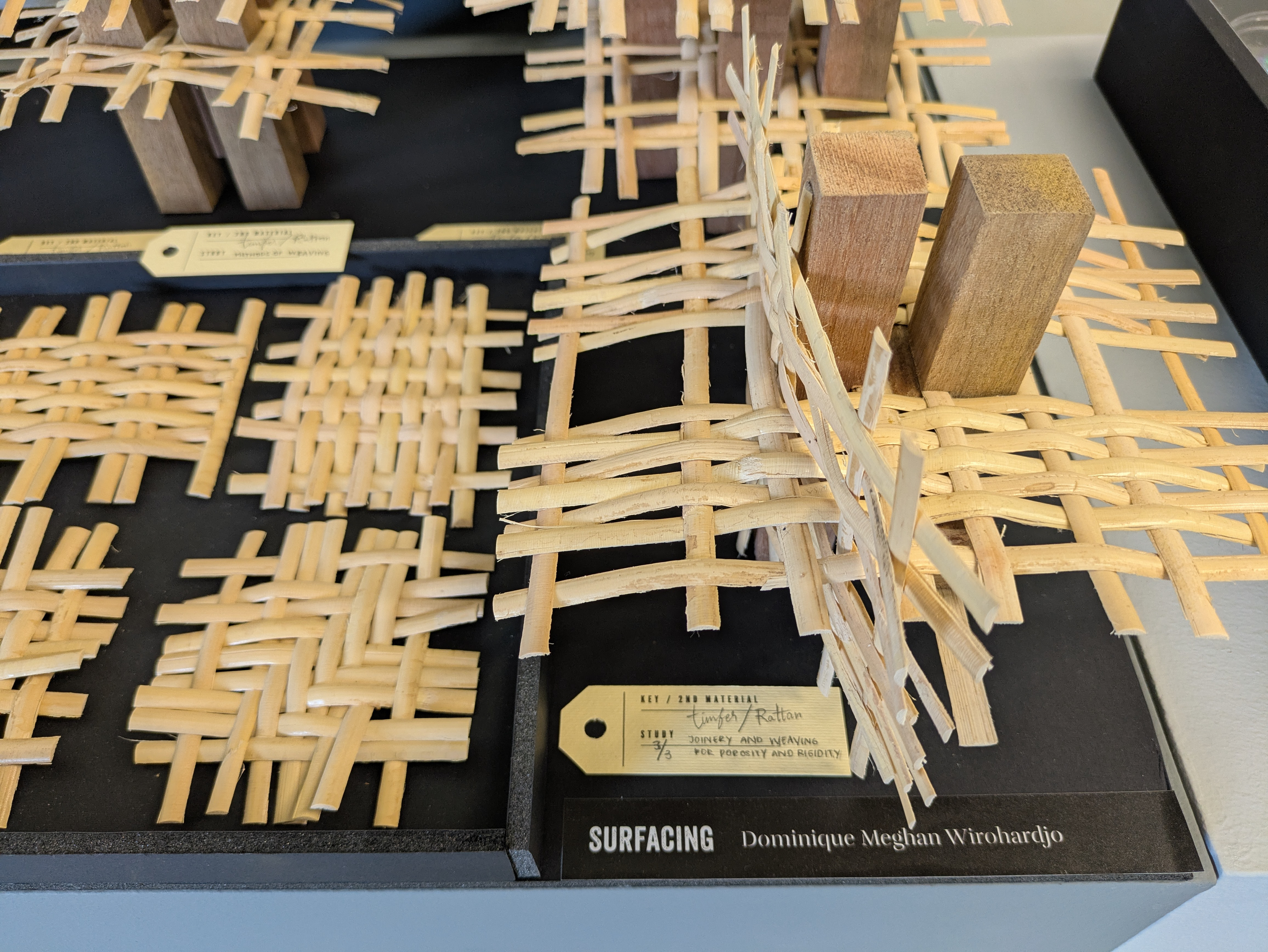
An important design problem we had to resolve was the labelling system of the artefacts. As these are exploratory pieces, they are presented as fragments that form a body of work. The labelling system needed to ensure the artefacts are clearly documented and effectively conveyed to the viewer.
The Art Direction
The direction we went with was inspired by the pragmatic visual design systems used in museums and galleries in presenting information. These often take the form of typographic hierarchies supported by rules and lines to establish visual order.
The direction we went with was inspired by the pragmatic visual design systems used in museums and galleries in presenting information. These often take the form of typographic hierarchies supported by rules and lines to establish visual order.
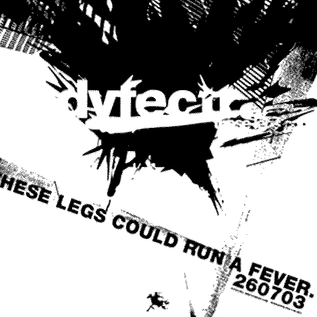
Our direction fused this with a touch of playful type and grit, as seen in the visual centrepiece and the typography of the exhibit logotype.
A Visual Centrepiece to Set The Tone
A visual centrepiece was animated as part of the key visual of the exhibit. It was designed to express an exploratory process through irregular shapes, scribbles, and layered textures.
A visual centrepiece was animated as part of the key visual of the exhibit. It was designed to express an exploratory process through irregular shapes, scribbles, and layered textures.
A Hands-On Approach to Strengthen the Visual Language
I was inspired by archaeological archival systems. Instead of conventional rectangular labels, I proposed hand-written tags attached to each artefact. The variation in penmanship gave each tag a sense of both tactility and identity.
I was inspired by archaeological archival systems. Instead of conventional rectangular labels, I proposed hand-written tags attached to each artefact. The variation in penmanship gave each tag a sense of both tactility and identity.
This echoed the hands-on processes on display and responded to the brief by presenting information clearly and directly, without requiring a separate visual map.
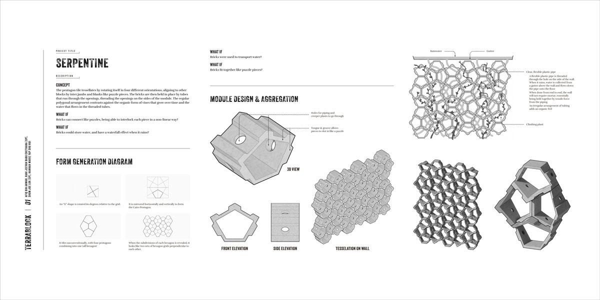
Visual Boards
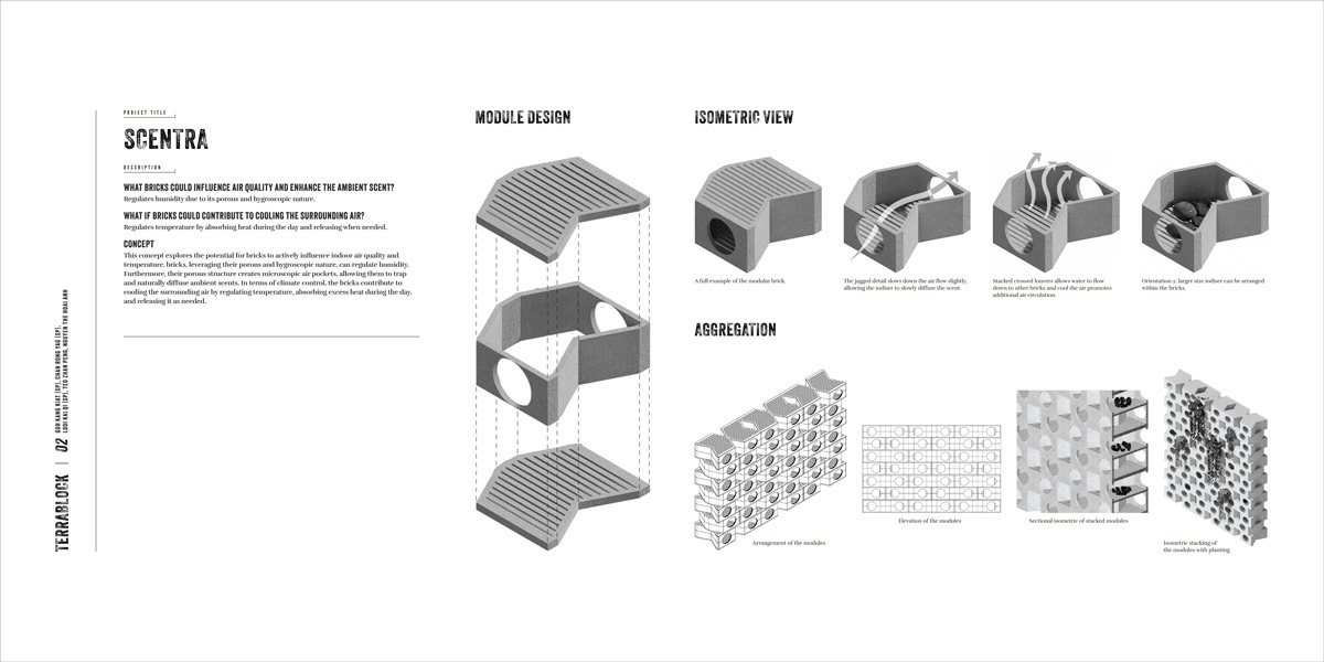
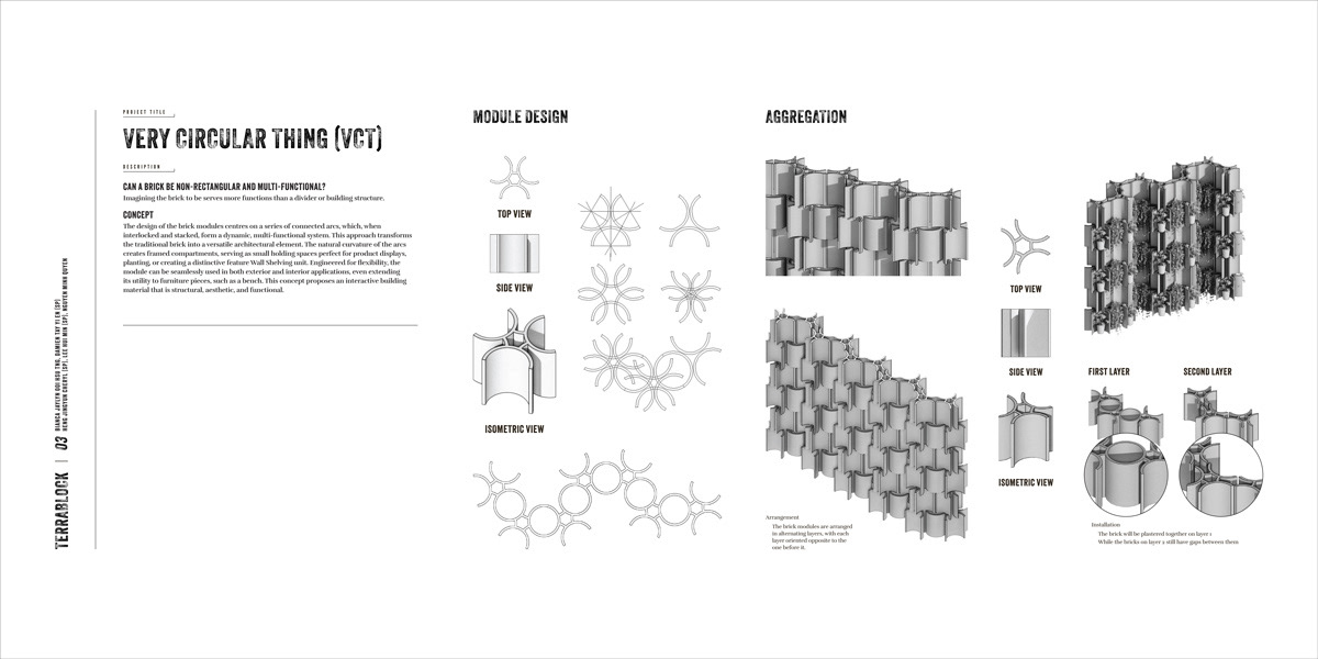
As the artefacts on display were raw rather than finished outcomes, we needed to ensure that the processes in the Terrablock workshop were presented neatly. A visual board template was designed to address this need. This ensured consistency in the visual language used throughout the exhibit.
As the artefacts on display were raw rather than finished outcomes, we needed to ensure that the processes in the Terrablock workshop were presented neatly. A visual board template was designed to address this need. This ensured consistency in the visual language used throughout the exhibit.