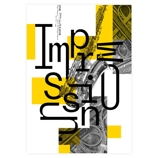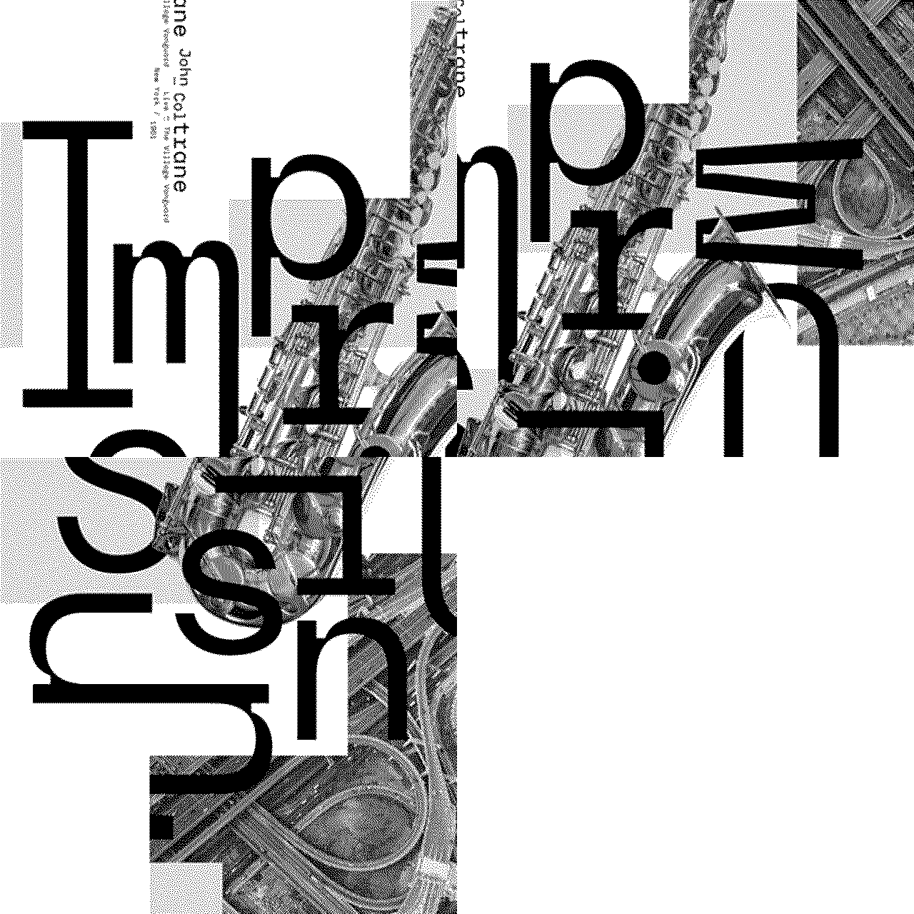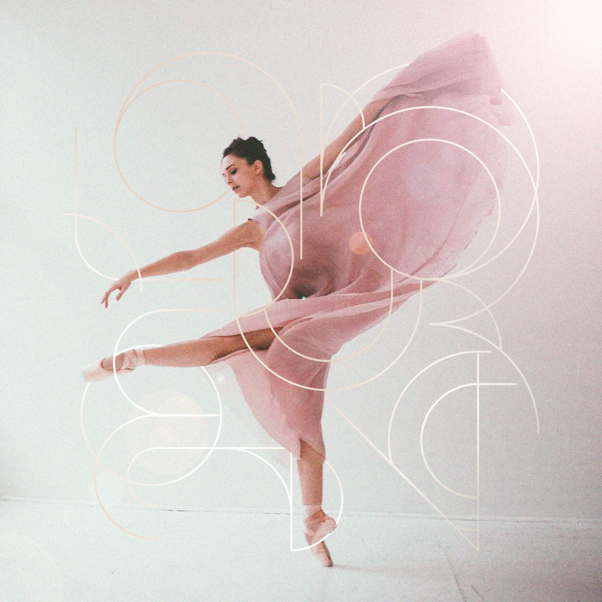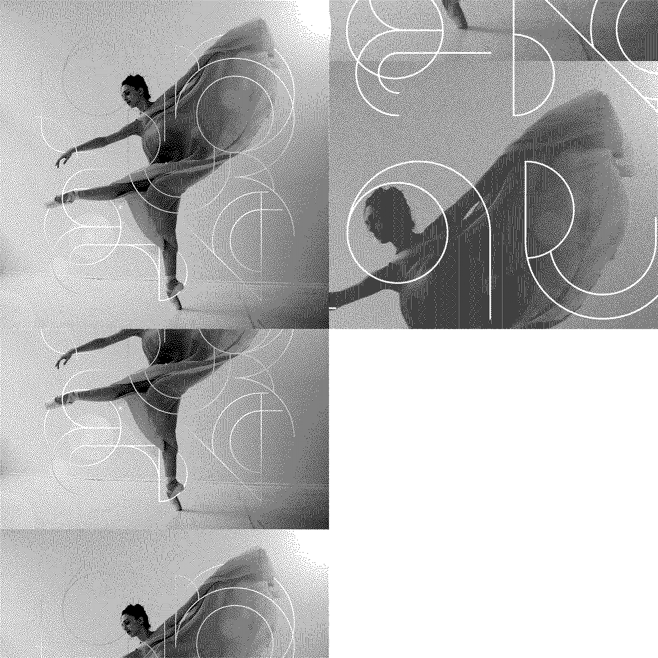
Exhibition logo designs
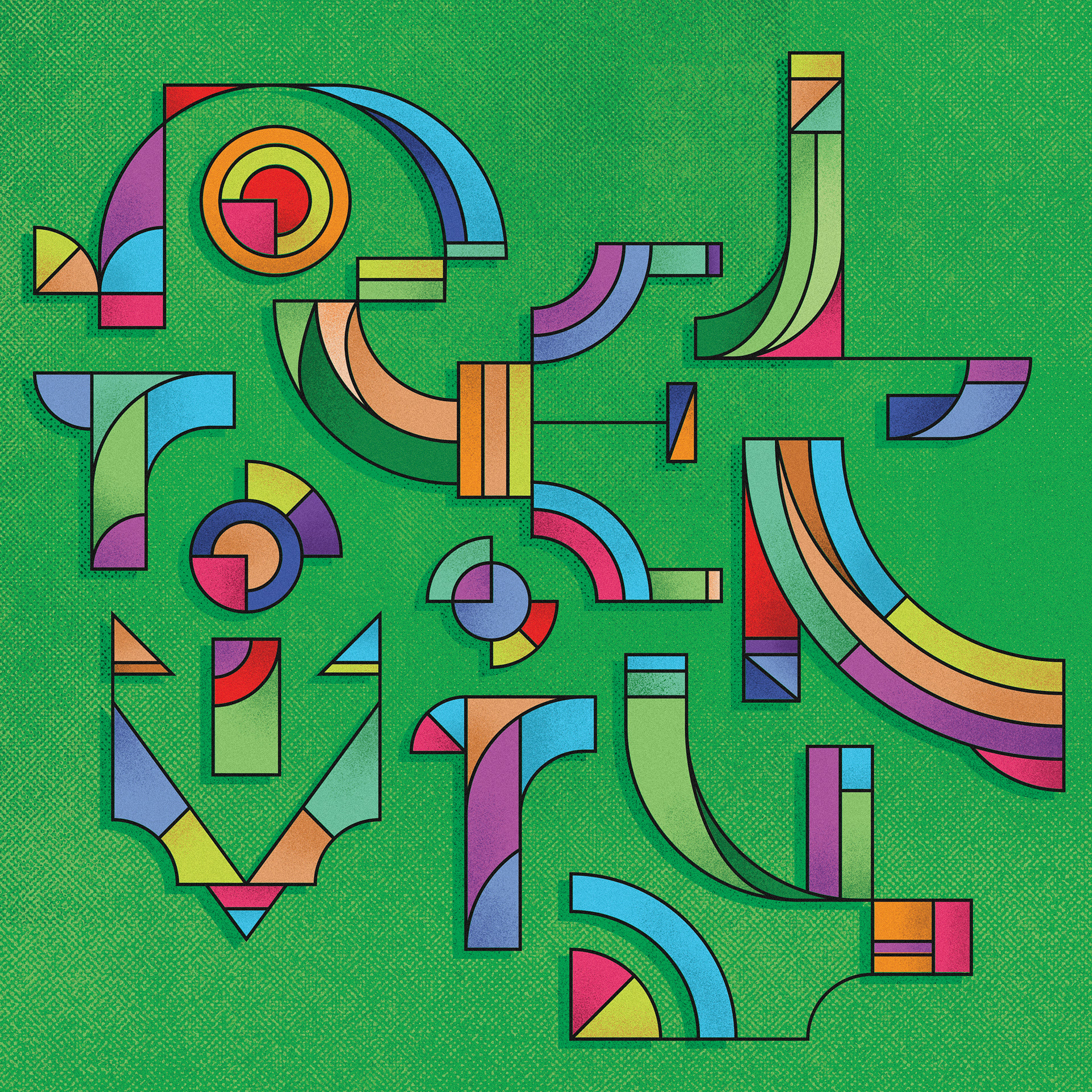
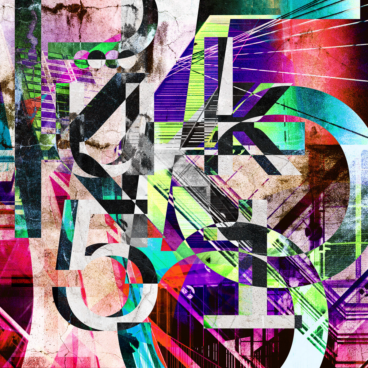
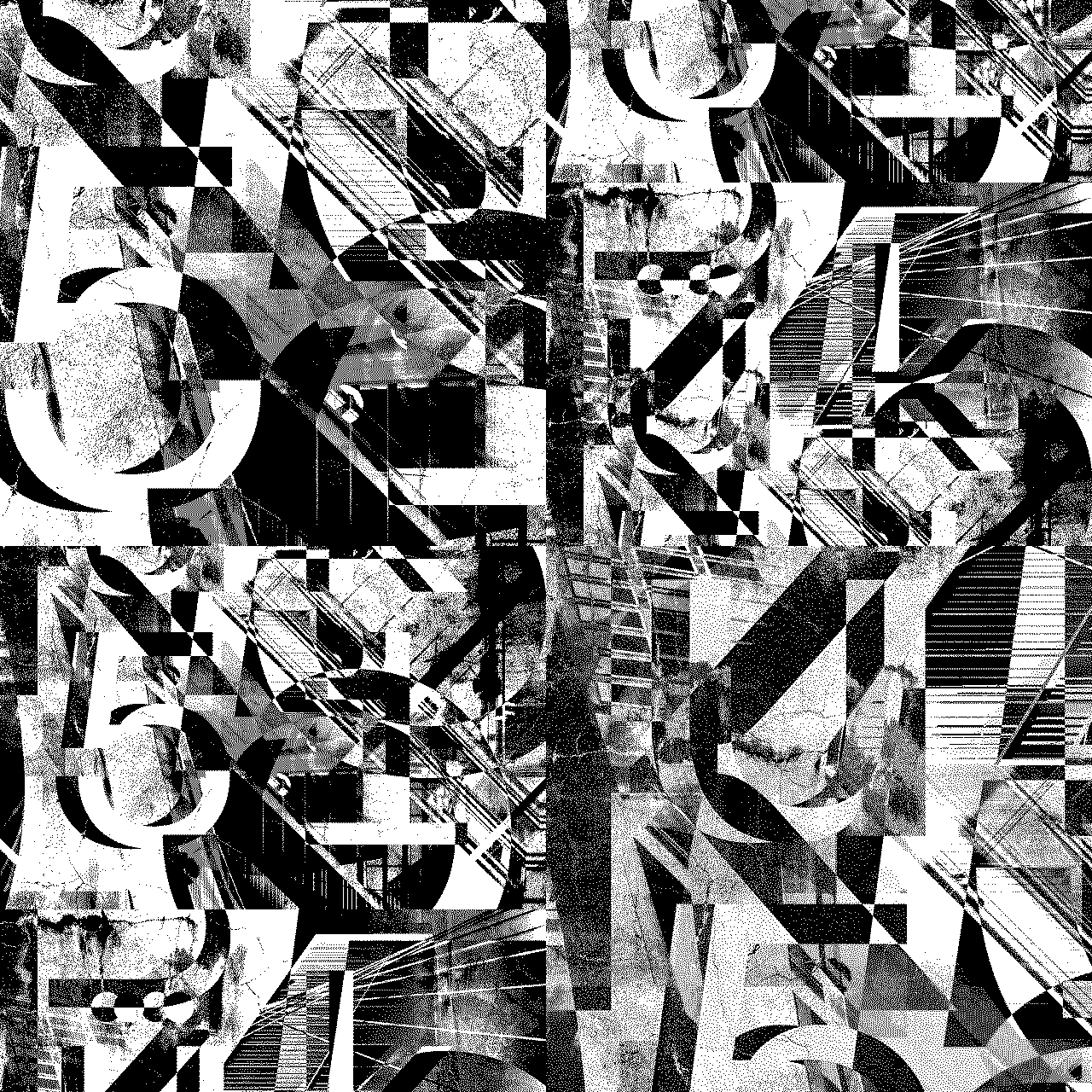
Project pillar: Process
Top: Variations / Bottom: Iteration for plinth
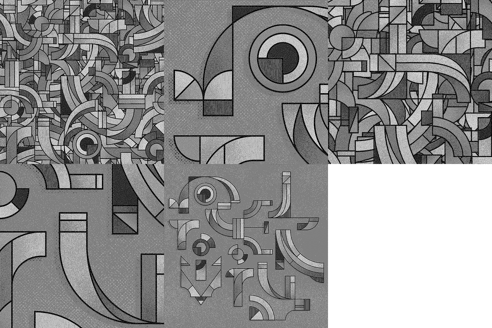
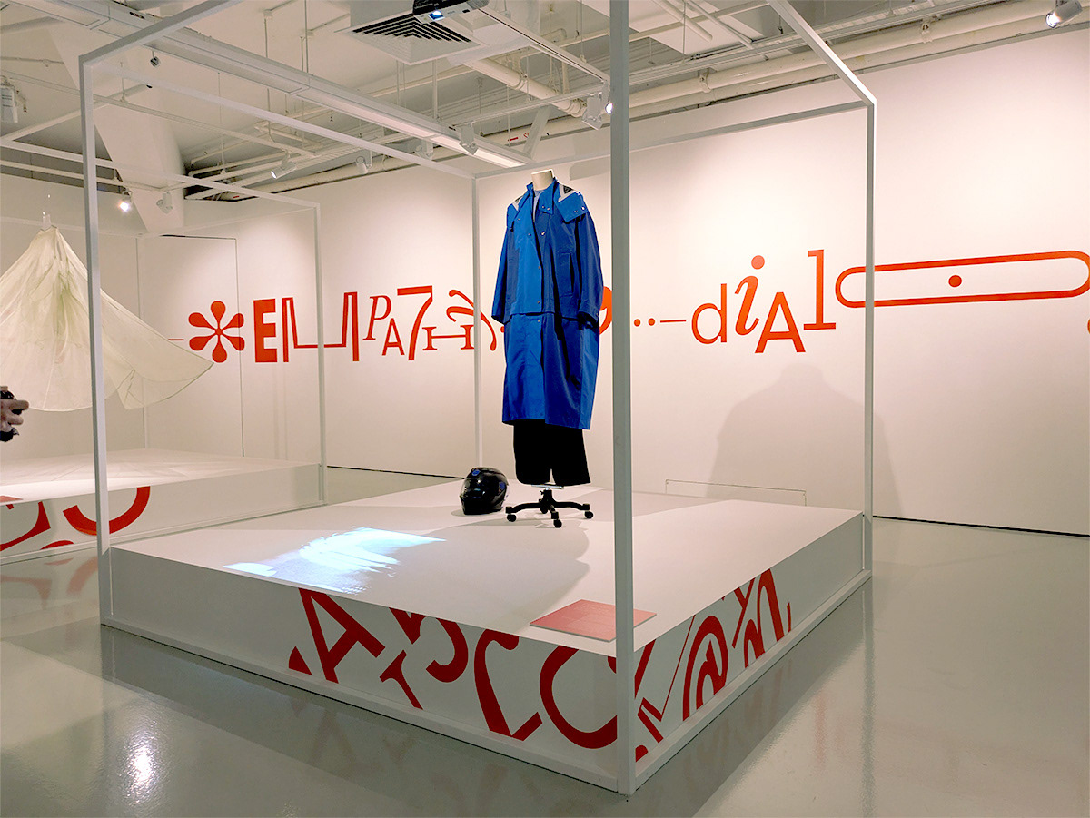
Project pillar: Empathy
Top: Variations / Bottom: Iteration for plinth
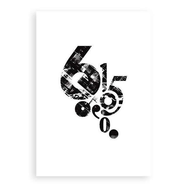
Project pillar: Transformation
Top: Variations / Bottom: Iteration for plinth
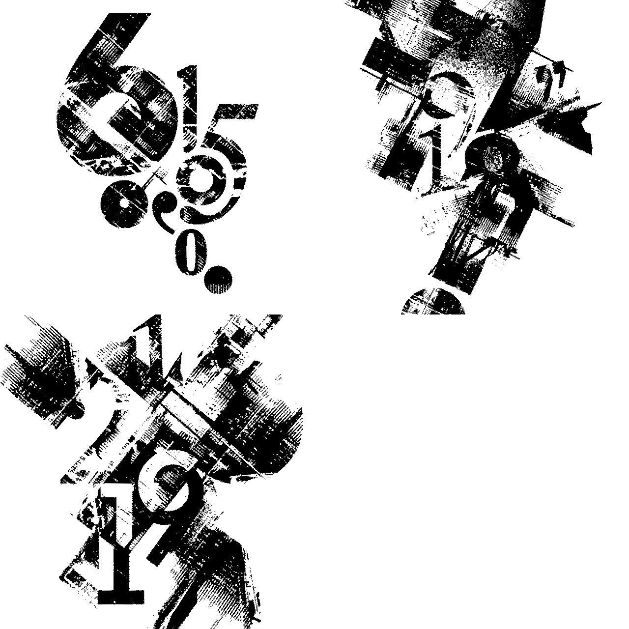
Project pillar: Dialogue
Top: Variations / Bottom: Iteration for plinth
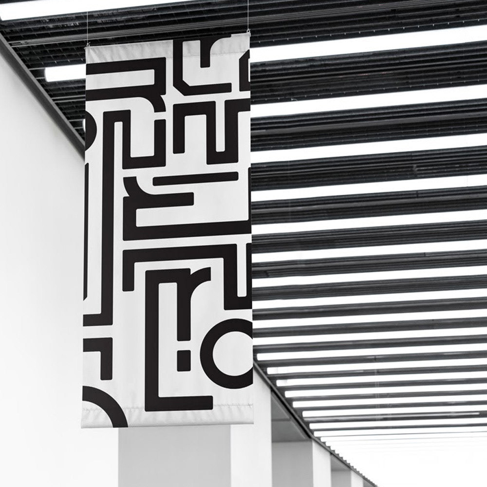
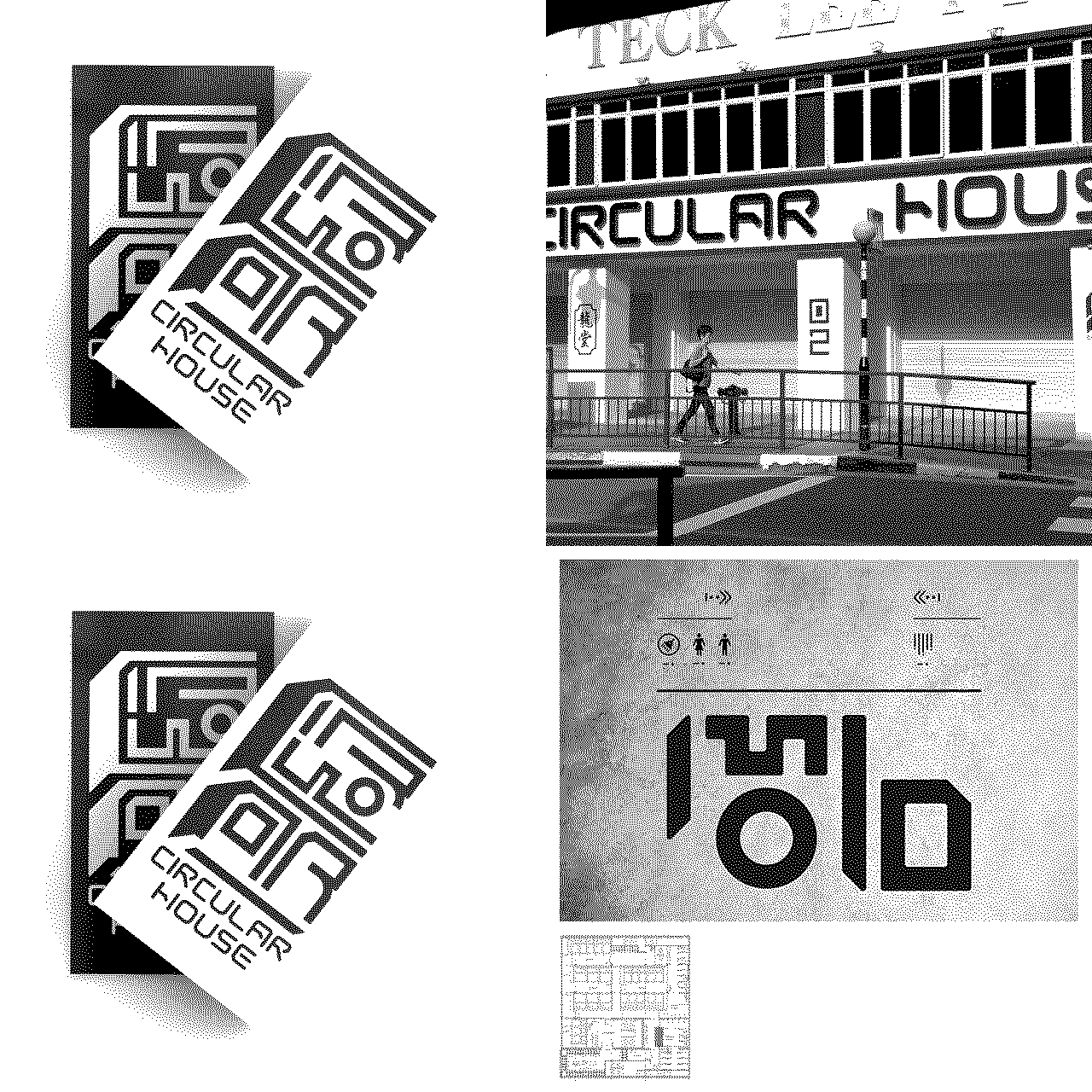
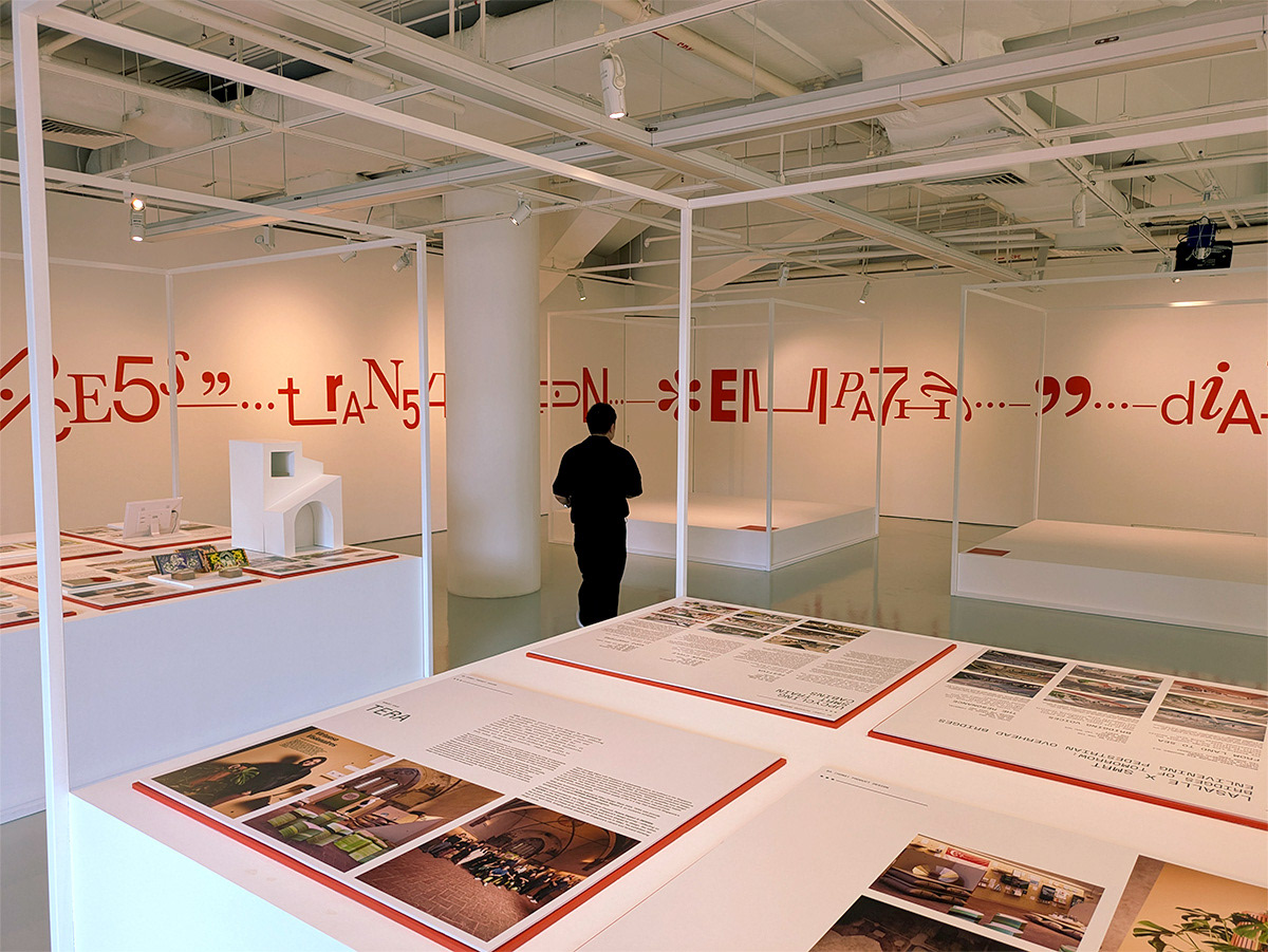
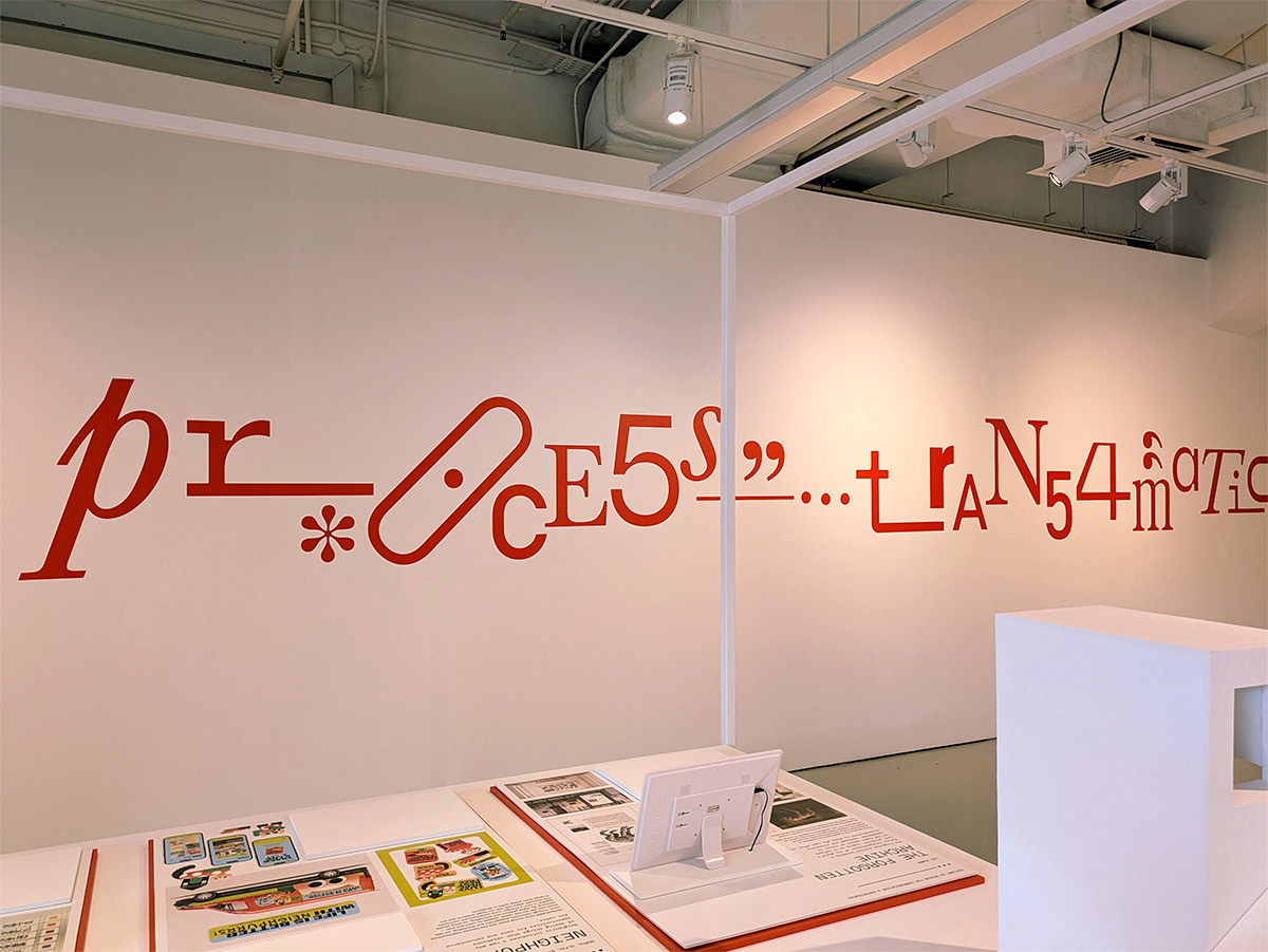
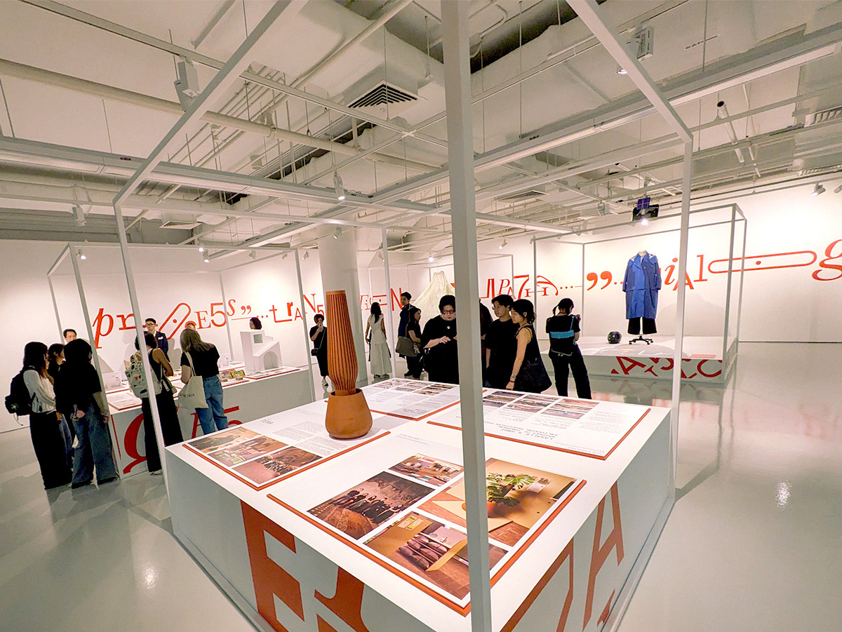
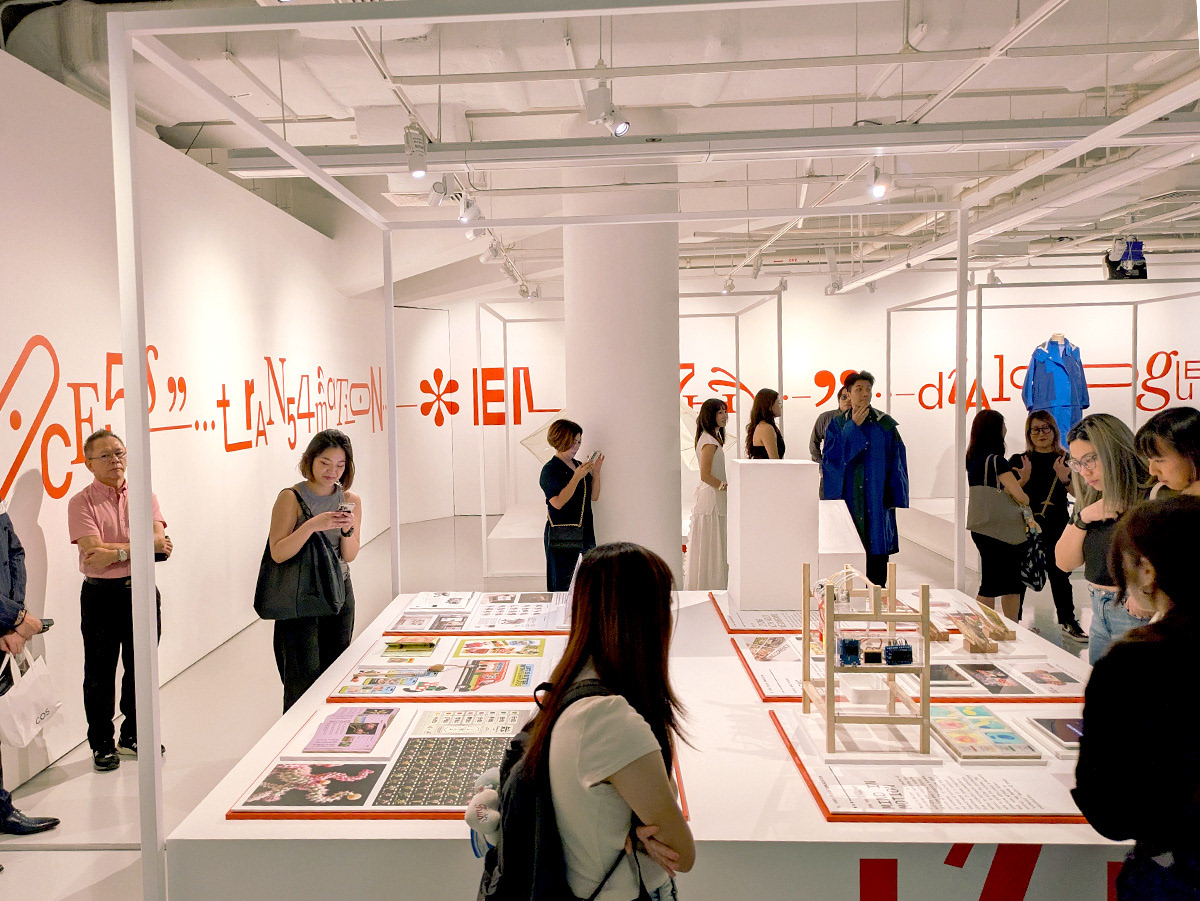
Typographic styling applied to exhibit walls.
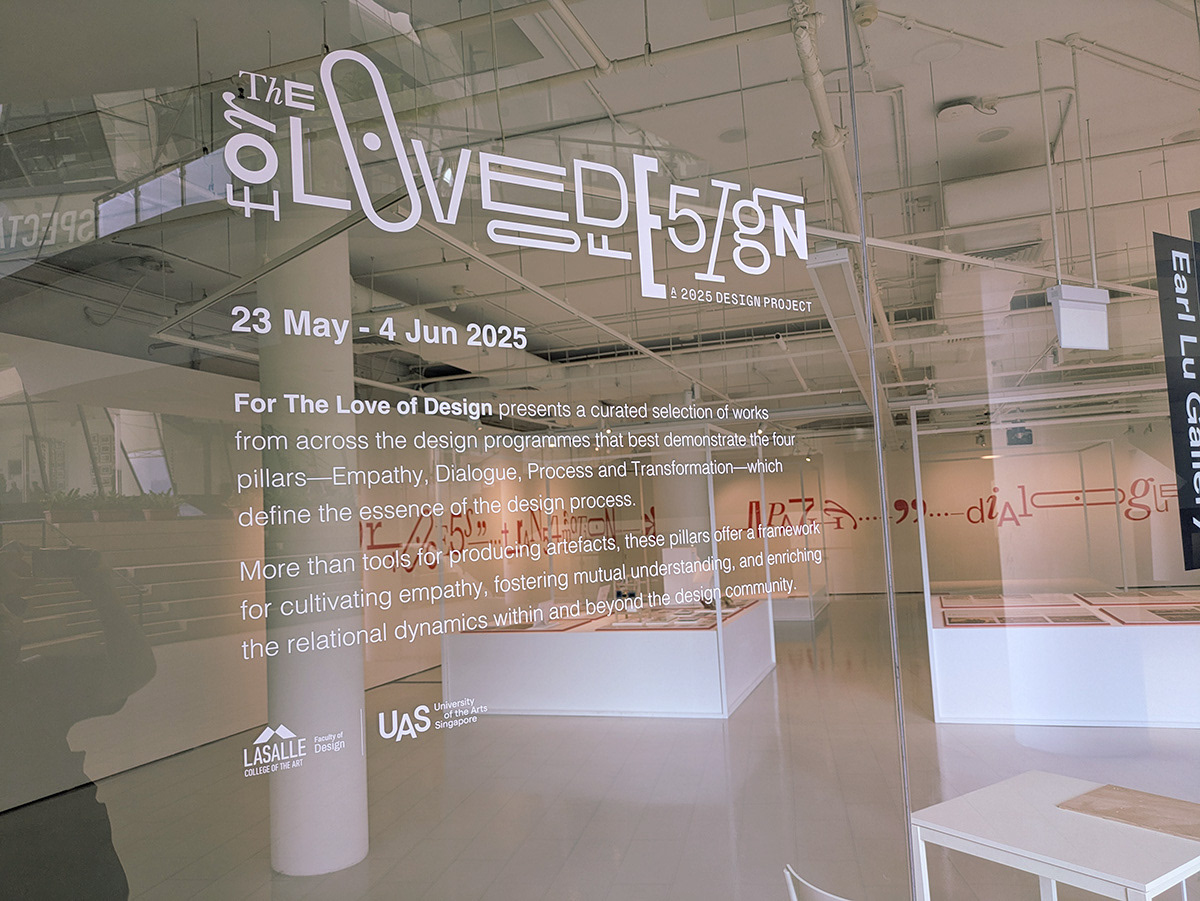
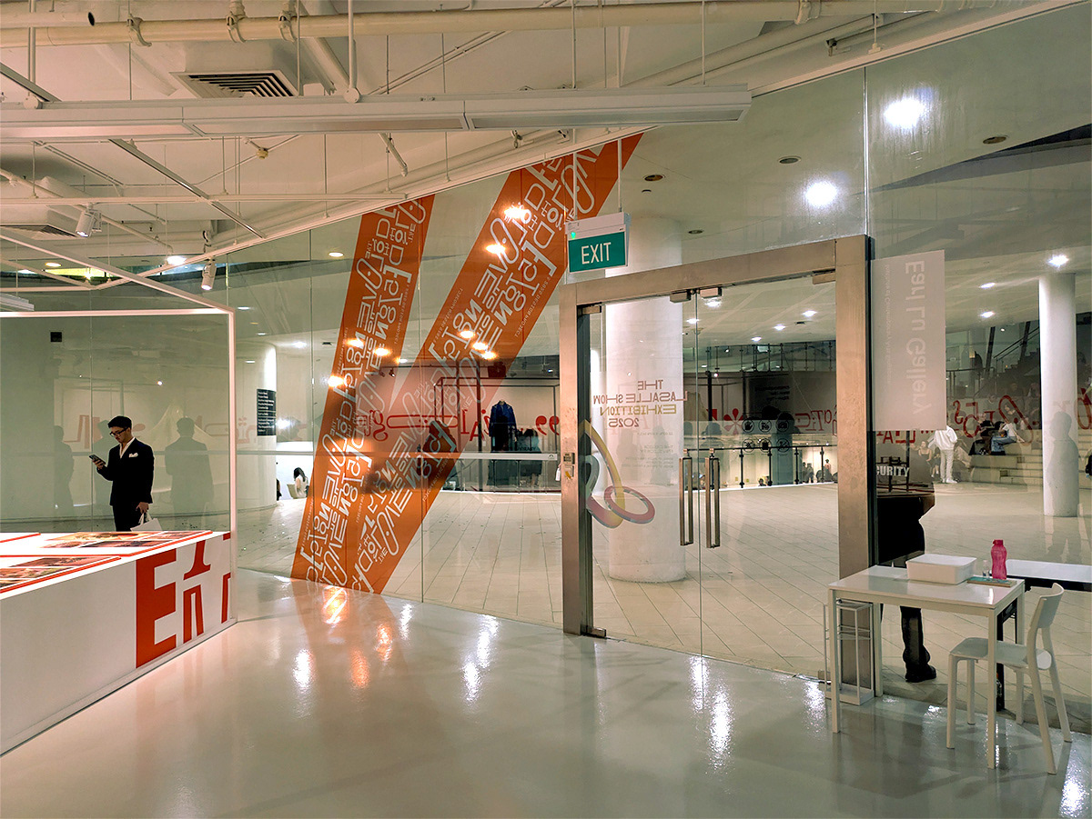
Application of logo as a design element. Applied at the exhibition entrance.
Animated social media post.
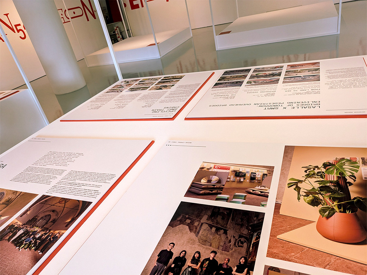
Example of a grid system for the projects. Grey boxes are designated spaces for physical artefacts / presentation tool.
Example of a grid system for the projects.
Design sample of project write-up.
The Project:
For The Love of Design: A 2025 Design Project
This project was commissioned by the dean of the design school in LASALLE. I was tasked to produce an identity and visual system to hold a silo exhibit of selected students' works during the LASALLE 2025 show.
The exhibition showcased works from different levels and disciplines. An integral part of this commission was to design a visual system that could host these different styles while maintaining a visual consistency throughout. I worked with the Interior Design programme leader, Jay. He did not only designed the physical aspects of the show, but also helped me tremendously in kickstarting the process.
Design Approach: For the Love of Design
To proclaim a love for something, speaks volumes about its depth and meaning. In this spirit, I wanted to express how multi-faceted design truly is — it is neither rigid nor dogmatic, but experimental, dynamic, and fun.
The dean requested this project to be typographic driven. The direction was to make a dynamic typographic experience, using words as visual elements, wrapping around the works and space, creating an immersive experience for the visitors.
Taking this cue I introduced a sense of play directly into the word 'design' itself. The use of multiple typefaces symbolises design as an ongoing process of exploration and discovery. To further emphasise continuity and movement, the identity features shifting letter sizes and arrangements, giving the logotype a lively, kinetic energy that captures the evolving spirit of design.
Taking cue from the exhibit title, For The Love of Design, I drew parallels between the concept of love and design. I see both as frameworks that rely on similar processes to function meaningfully. With four display plinths anchoring the exhibition, the team and I assigned four keywords as thematic pillars and the source of the visual direction: Empathy, Process, Dialogue, and Transformation.
In many exhibitions, typographic treatments tend to lean toward conservative expressions, i.e the relay of message and information. For this show, I wanted a bolder and more experimental approach. Each of the four keywords has been treated typographically to reflect the playful, exploratory nature of design. The goal is for the words to create a playful atmosphere within the space — not just communicating intent, but inviting the audience to feel involved in the meaning and process behind them.

