Application of logos.
The Project
We were tasked with providing a narrative and identity for an upcoming capsule hotel, Circular Hotel. One of the points that makes this project unique is the intent of the founders to blend the new (relatively new habits of accommodation) with the old (instilling a deep sense of local * history and culture).
Another interesting angle that this project entails is the documentation of the next wave of local entrepreneurs updating the cultural fabric here in Singapore by potentially forging new dynasties by blending the dichotomy of heritage protection ** and economic opportunities **.
References:
* local: In reference to both colloquial and regional influences.
** Living Legacy: Robert Powell
* local: In reference to both colloquial and regional influences.
** Living Legacy: Robert Powell
FUTURE HERITAGE
Above are some of the drafts leading up to the selected logo mark.
LET’S TALK ABOUT “FUTURE HERITAGE”
The potential Circular House has on the impact of its surroundings is not confined to just being a physical presence, but ideally on a cultural one as well. Although the strong oriental roots (parallel projects like Dragon Chamber as well as the sites history) is apparent, it shouldn’t be viewed as an impediment in creating a pluralistic identity.
Utilizing cultural identities as a primary approach is apt as it represents the intent of blending the new and old very well. It ties in with the progressive notions of conservation, where we do not only stall or hover over themes of heritage’s past, but also hold gravitas to the concept of continuity, as without it, the heritage we experience will be reduced to just a monument of nostalgia.
Continuity in this aspect bleeds in the concept of the contemporary. About making an aged heritage relevant in a globalized time where definitions are blurred. This is a brilliant opportunity to insert visual cues that suggest lightness and flexibility that connotes relevancy in current times.
THE LOGO
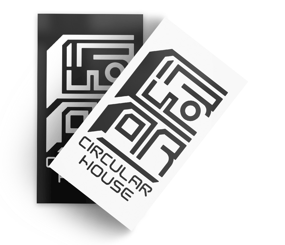
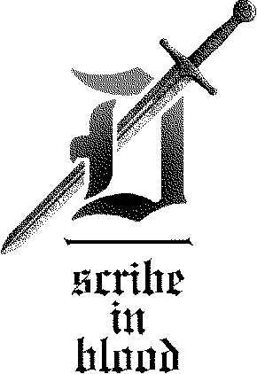
Selected logo.
Some of the challenges we faced in designing the Circular House identity were about keeping plurality and visual familiarity while still keeping an element of the contemporary in.
We also thought about how an oriental visual language would seem, if it were up to us (acknowledging current vernaculars, etc). It is a mix between typographical progress on the Roman front with Chinese characteristics.
We also thought about how an oriental visual language would seem, if it were up to us (acknowledging current vernaculars, etc). It is a mix between typographical progress on the Roman front with Chinese characteristics.
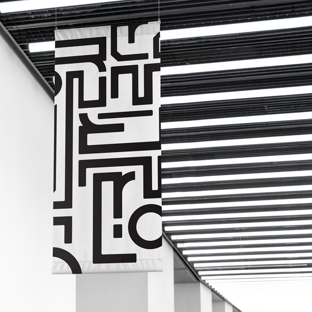
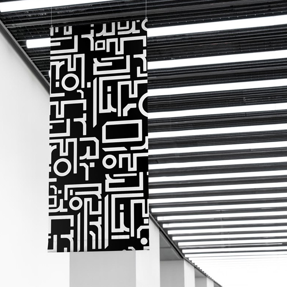
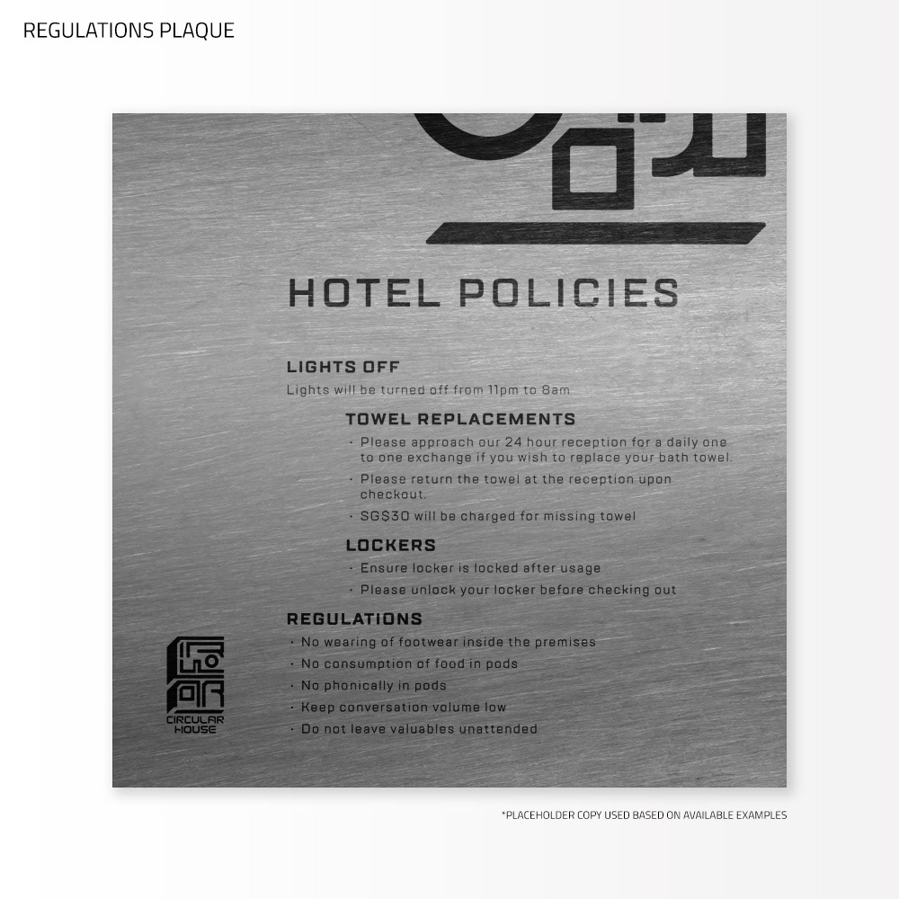
GRAPHIC APPLICATION
The following images show the further application of the identity throughout the hotel. The situation of the hotel however got complicated as there was a change of ownership. Whilst the proposal of these drafts got approved, its execution in the hotel got halted.
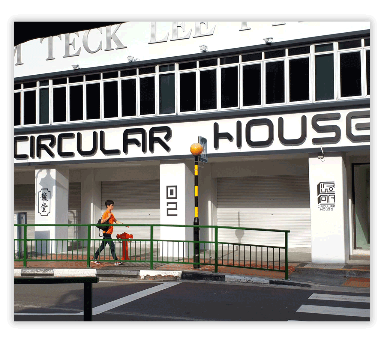
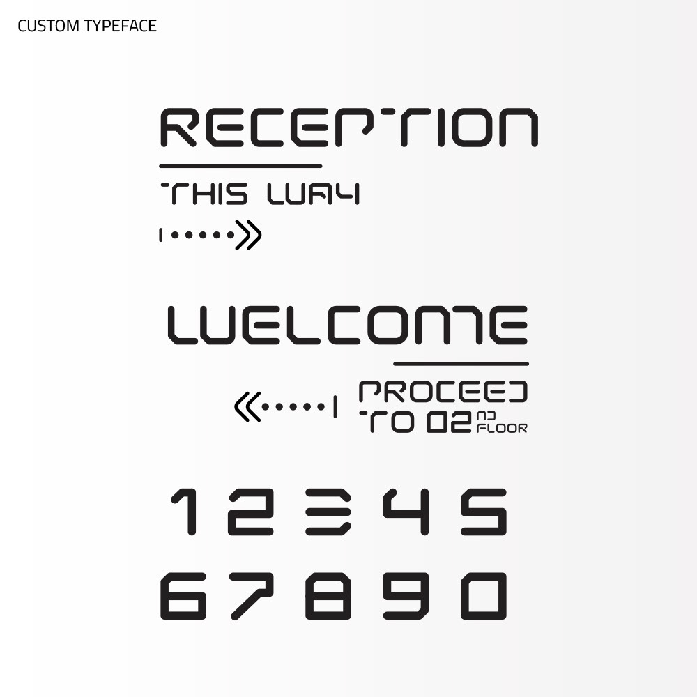
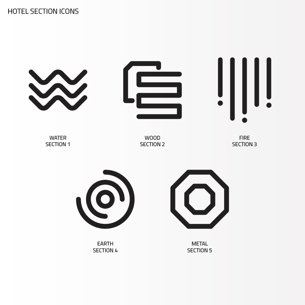
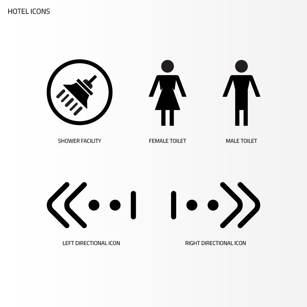
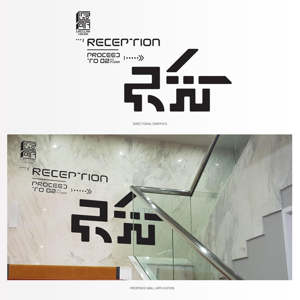
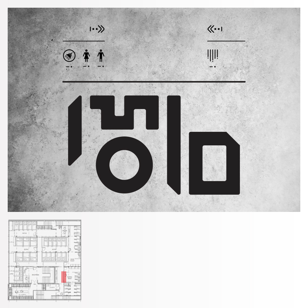
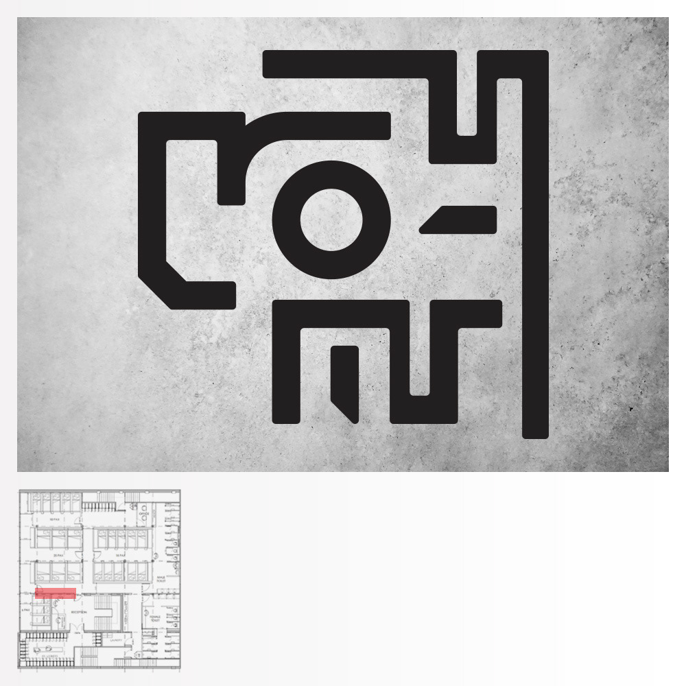
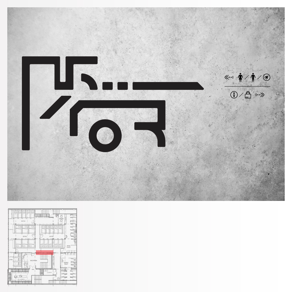
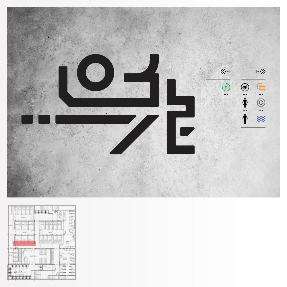
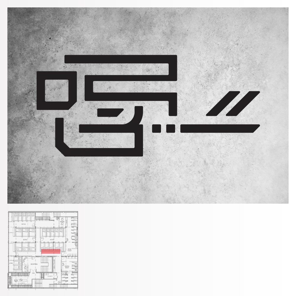
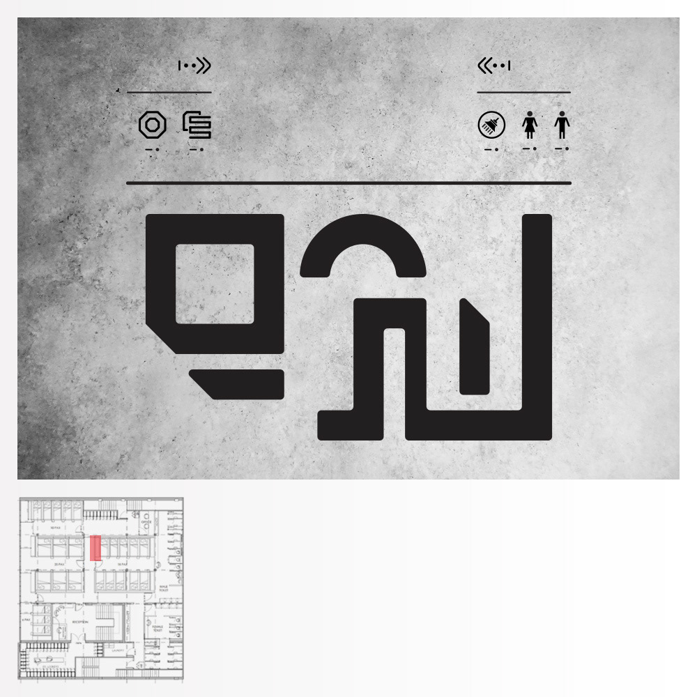
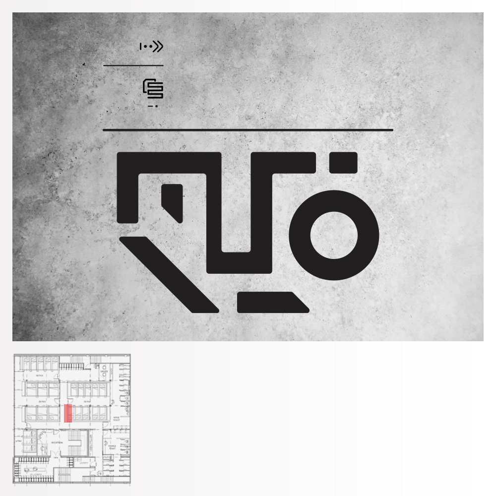
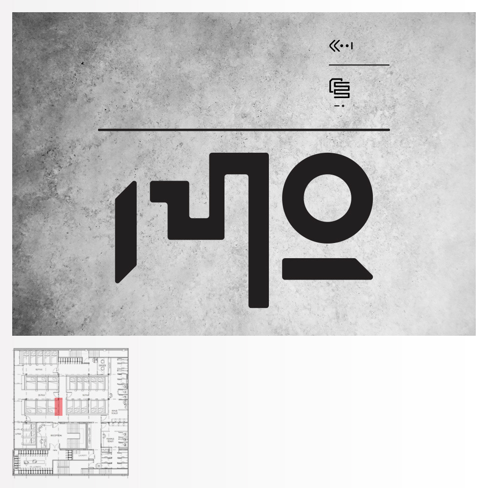
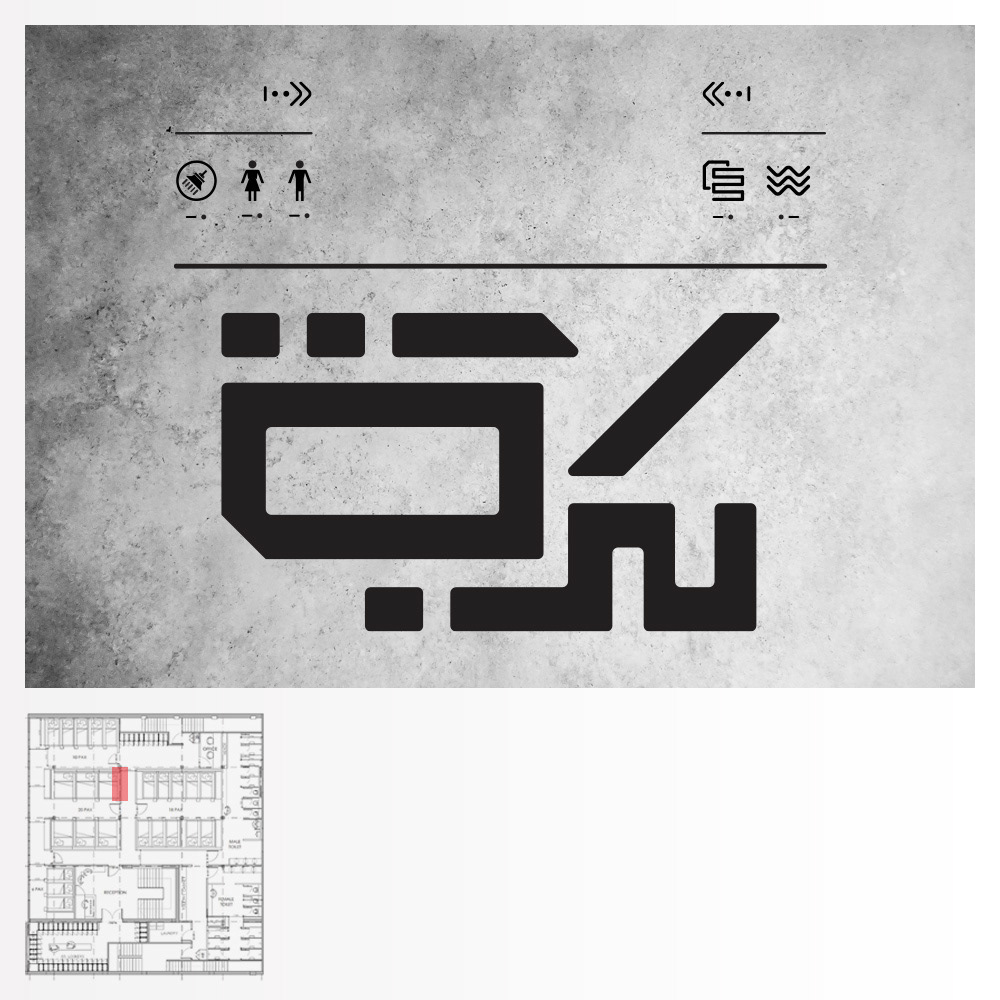
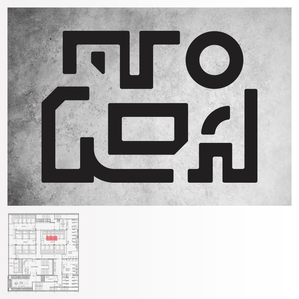
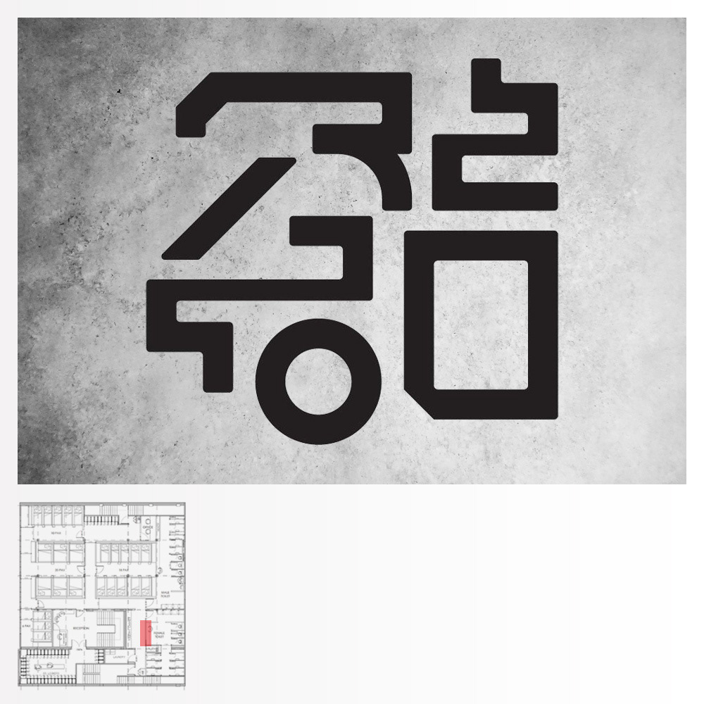
CUSTOM TYPEFACE & WAYFINDING SIGNAGE
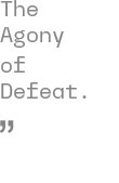
ENTRANCE GRAPHICS
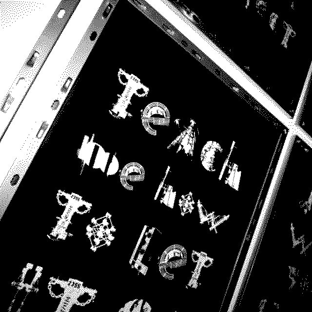
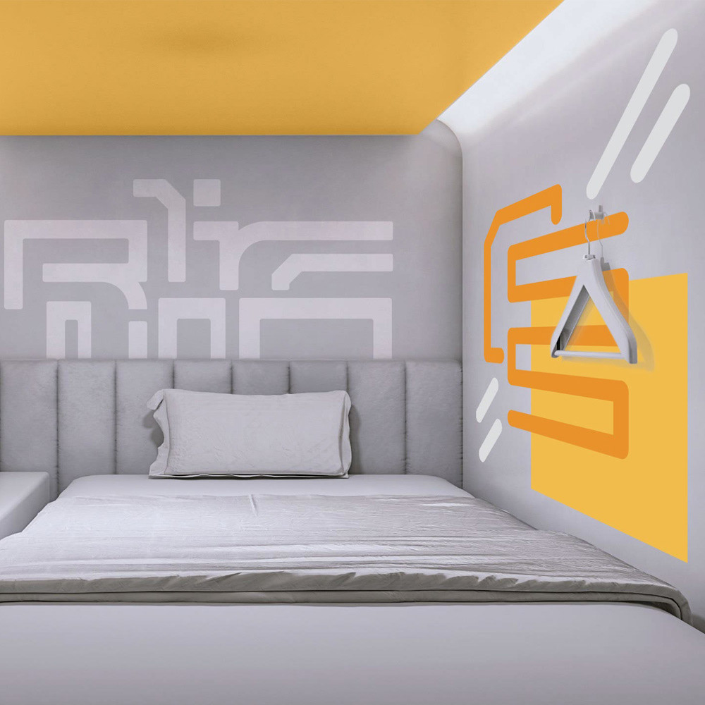
ROOM GRAPHICS
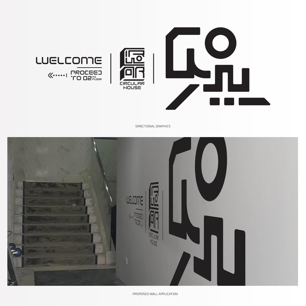
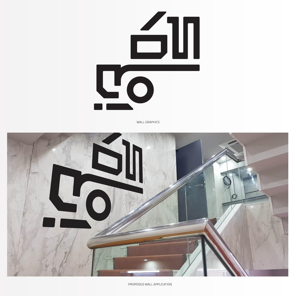
WALL GRAPHICS
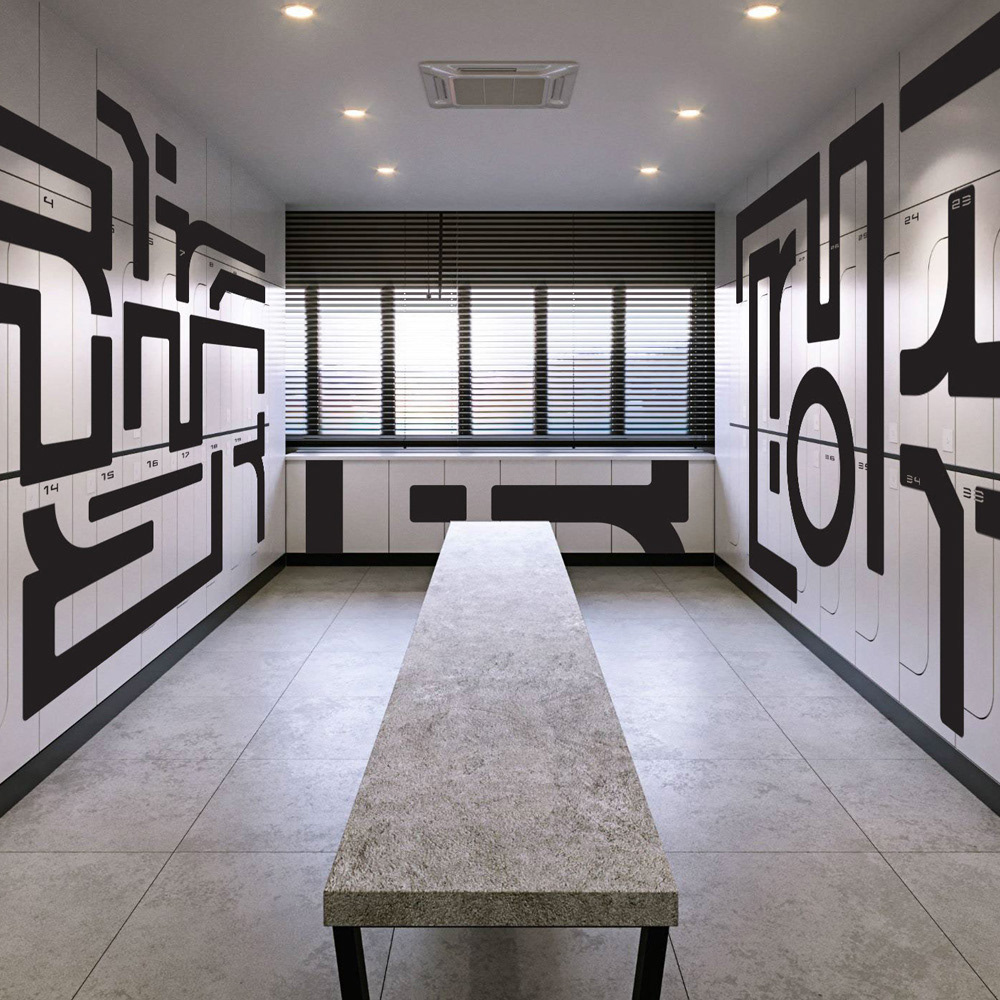
FURTHER APPLICATION
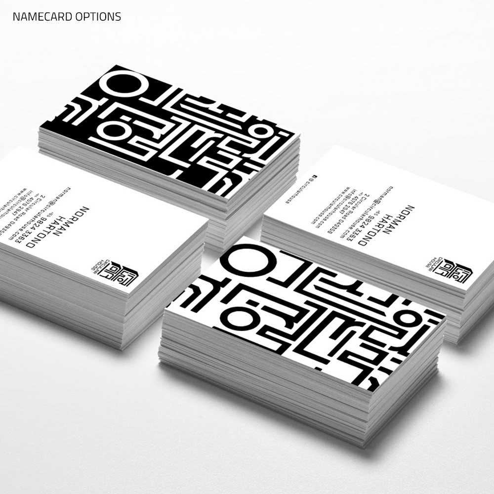
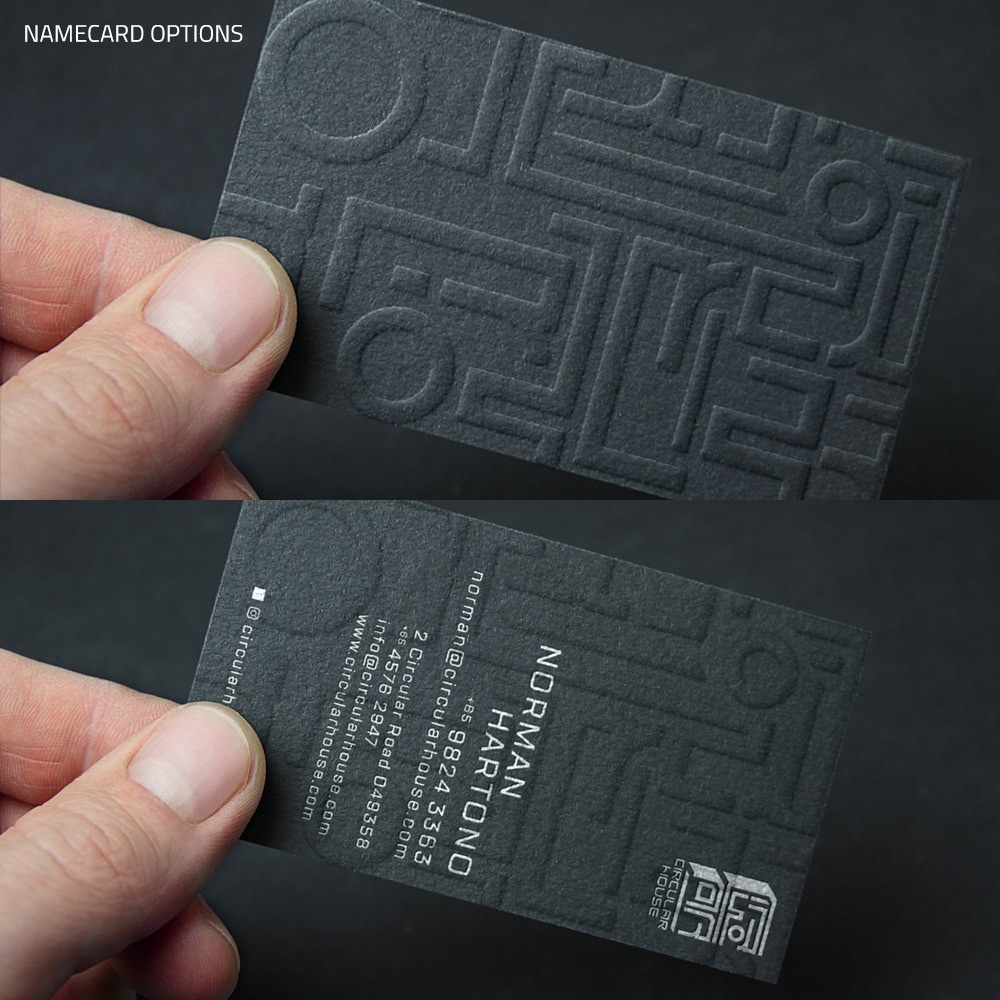
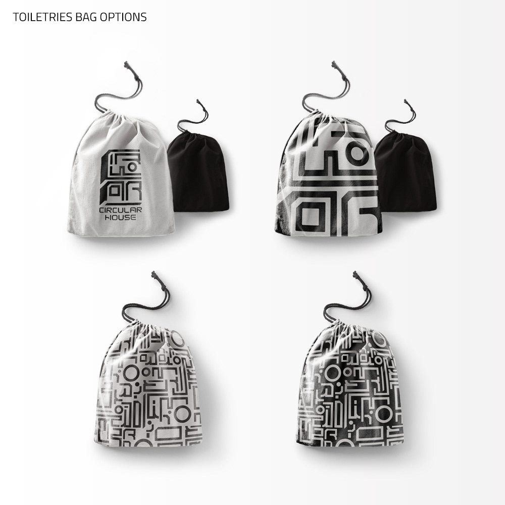
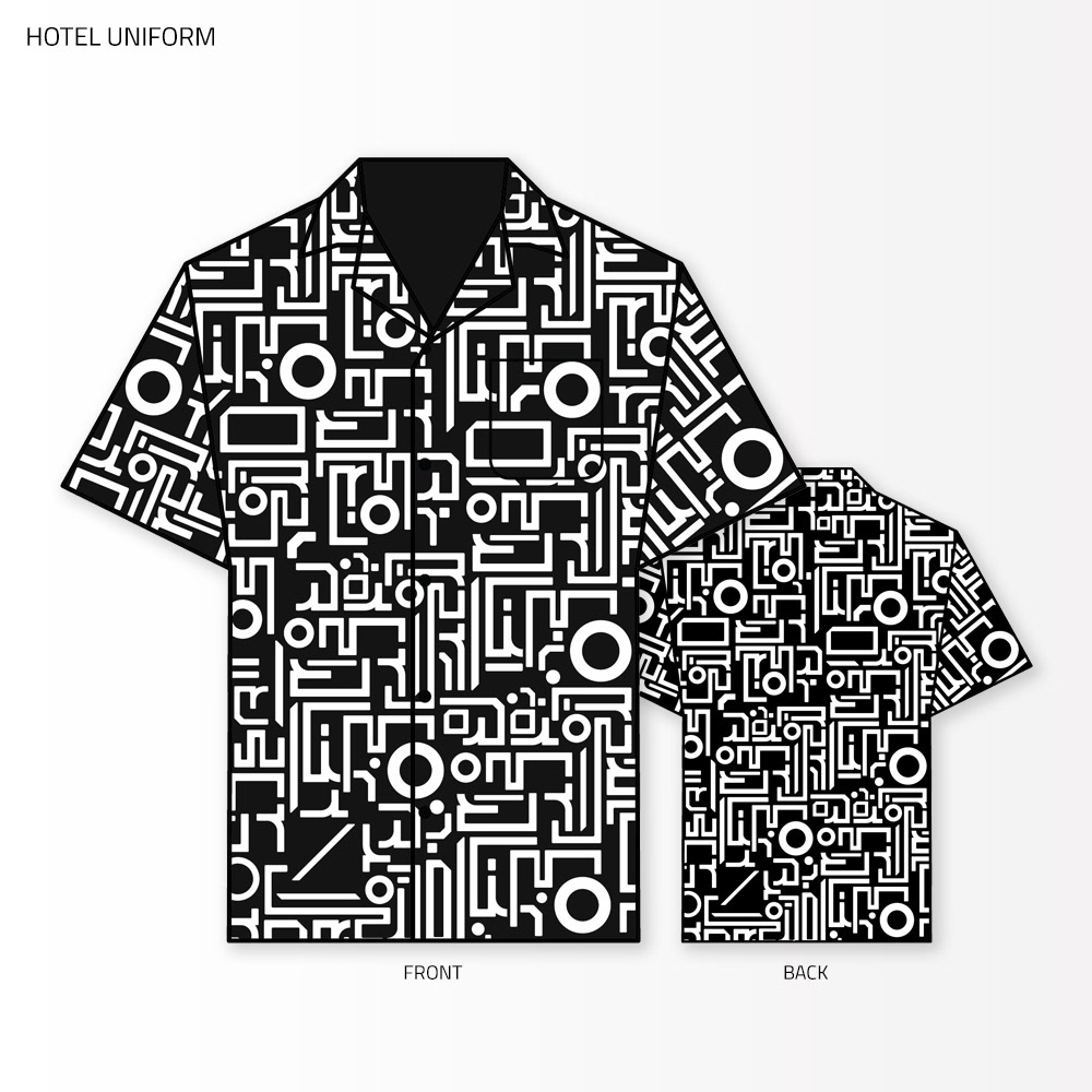
Further application of the hotel identity was expanded to the hotel deco, uniforms, namecards, etc. These proposals we did were well received by the previous ownership, but were put on hold after the change of management.
WEBSITE DESIGN
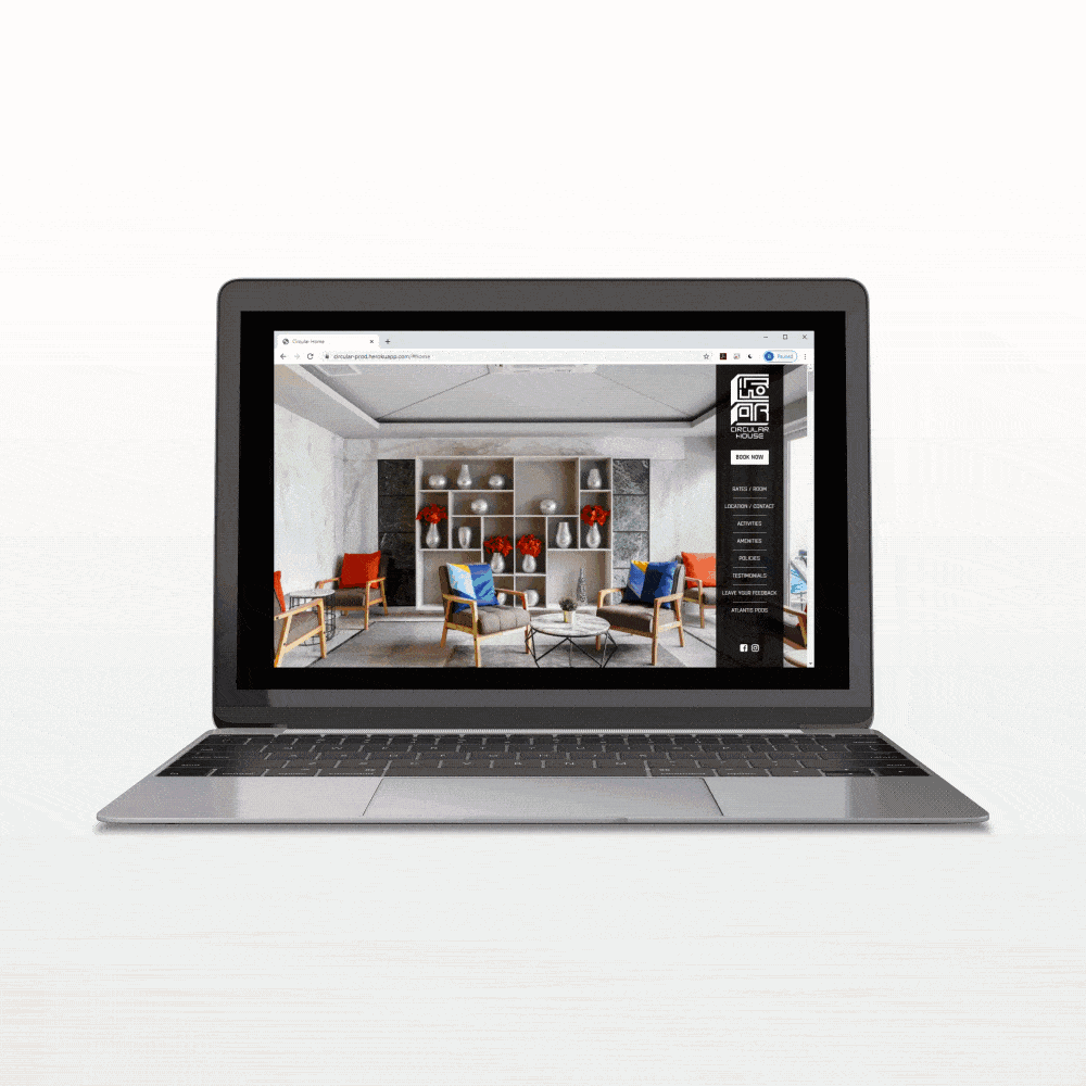
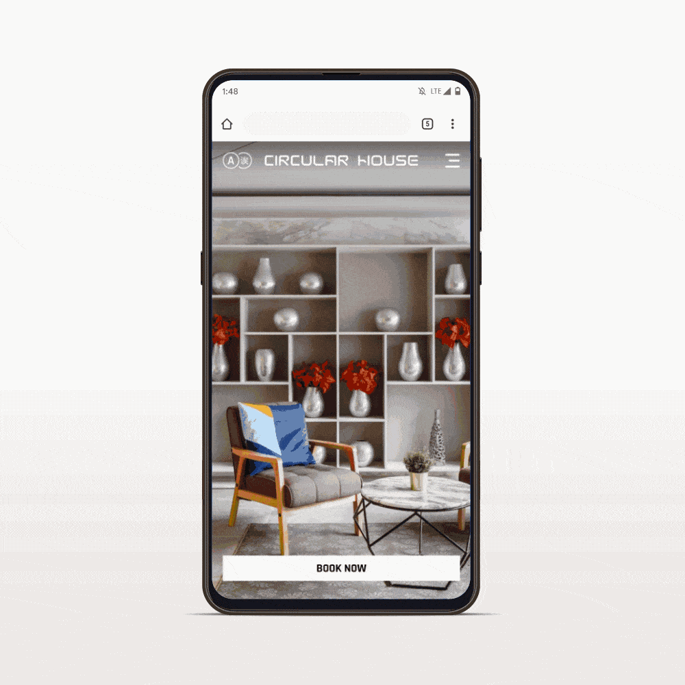
The hotel website was designed in line with the futuristic tinged vision we had. We took a route that differs from the visual sentiment often associated with accommodation based aesthetics. The site is currently in progress.