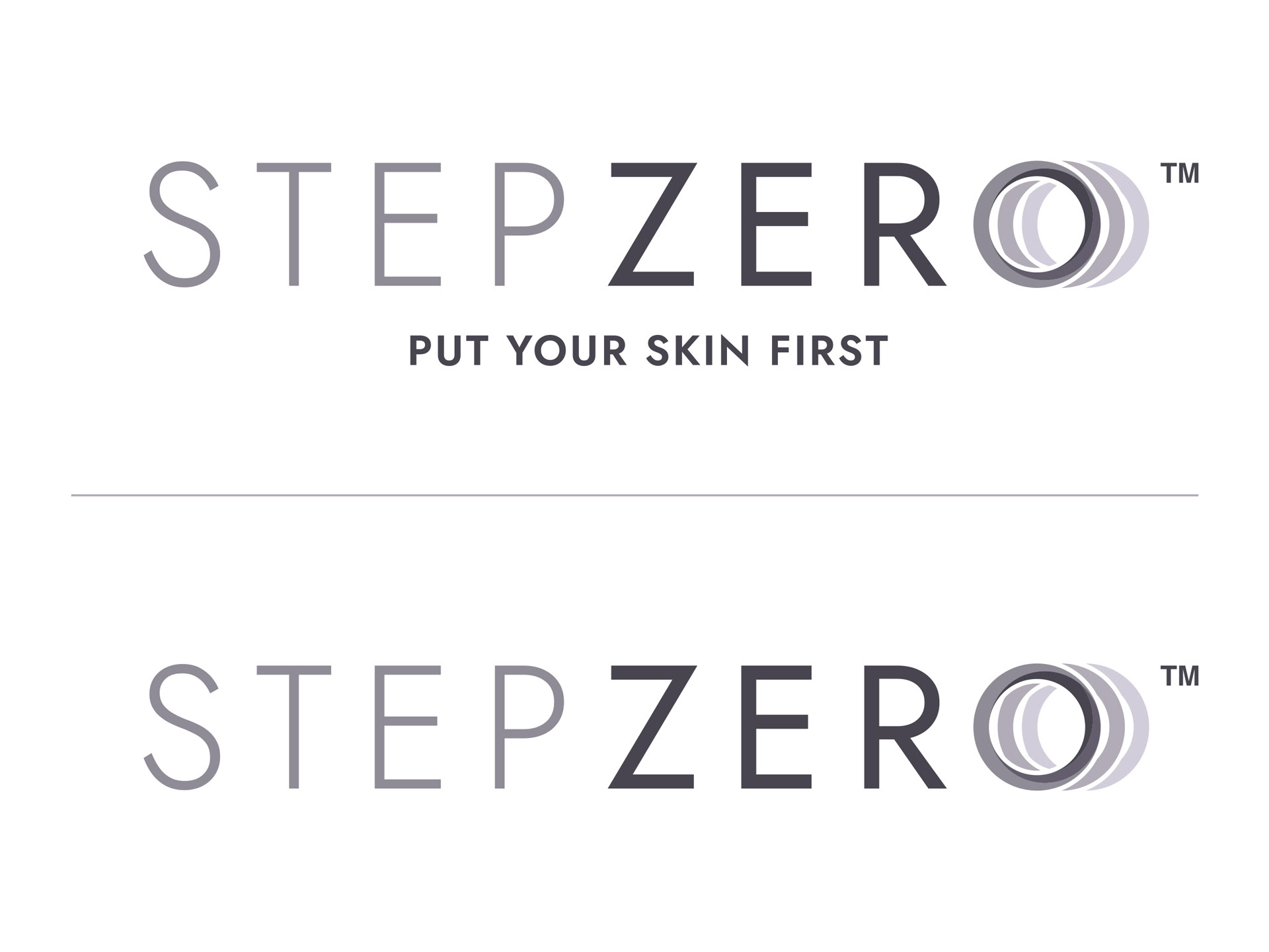
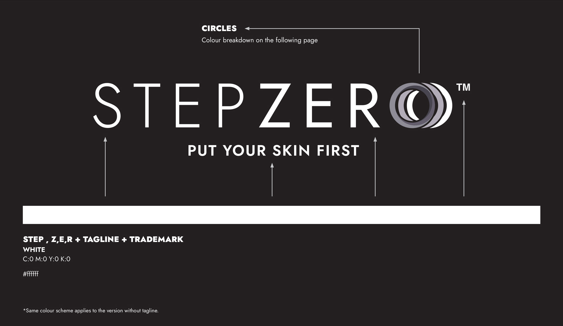
THE LOGO
THE CONCEPT
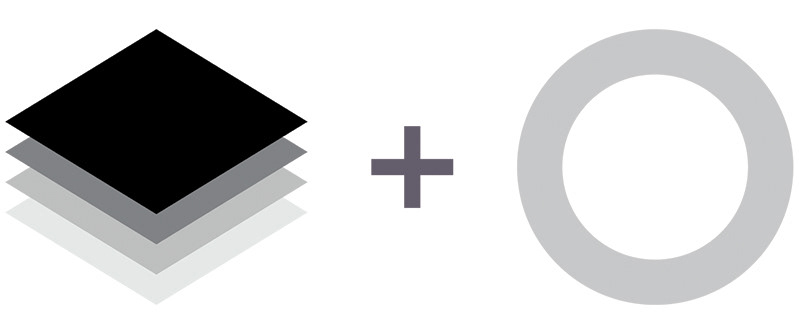
LAYERS
In our exploration, we found the concept of layering very apt to this project. It signifies
both the layers found in our skin as well as the many layers of steps involved in attaining
beautiful skin. This is visually expressed by showing the layers behind the numeral ‘0’ in
subtle gradation colours.
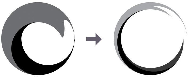
WAVES
We returned to the brief to find other ways to approach the logo’s design, keeping in
mind the key selling point of ‘Minimum Effort, Maximum Effect’. We studied items that
exemplify this and found waves to express this sentiment well, as they’re a culmination of
small actions leading up to a giant crescendo.
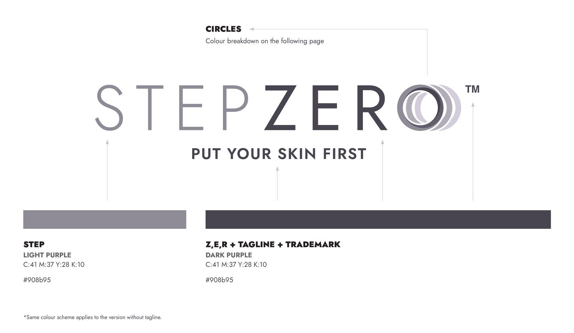
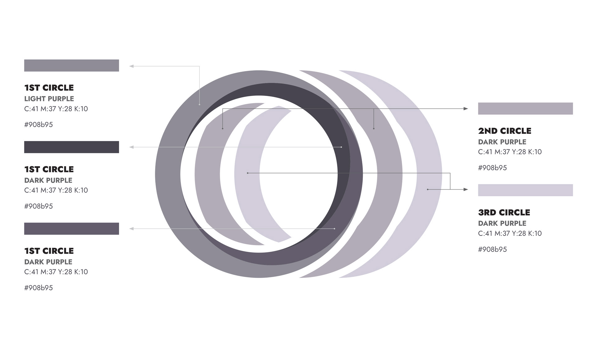
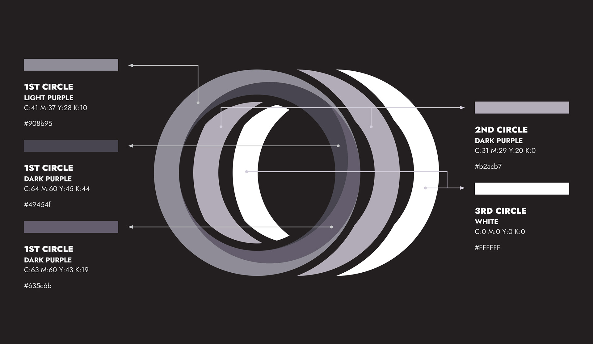
LOGO GUIDELINES: COLOURS
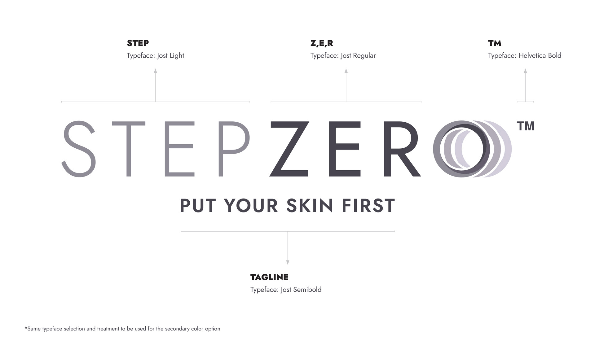
LOGO GUIDELINES: TYPEFACE
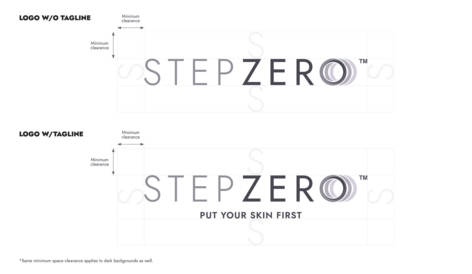
LOGO GUIDELINES: MINIMUM SPACE CLEARANCE
The Project
Step Zero is an initiative by Merz Aesthetics. It is a range of pre-skincare aesthetics treatment. It was a great project to work on, as the collaboration with the client, as well as both writing and account managing departments was insightful and concise. This tremendously aided the design process.
Key visuals were also designed, and a logo guide was put together to show how this logo fits in both Step Zero's and Merz Aesthetics' visual ecosystem.
Agency: Societal
Creative lead: Djohan Johari
Copywriter: Khalid Chaudhari
FA Artist: Henry Chiu
Account Manager: Ashley Leong
Copywriter: Khalid Chaudhari
FA Artist: Henry Chiu
Account Manager: Ashley Leong