

Book cover


TYPEFACE DRAFTS
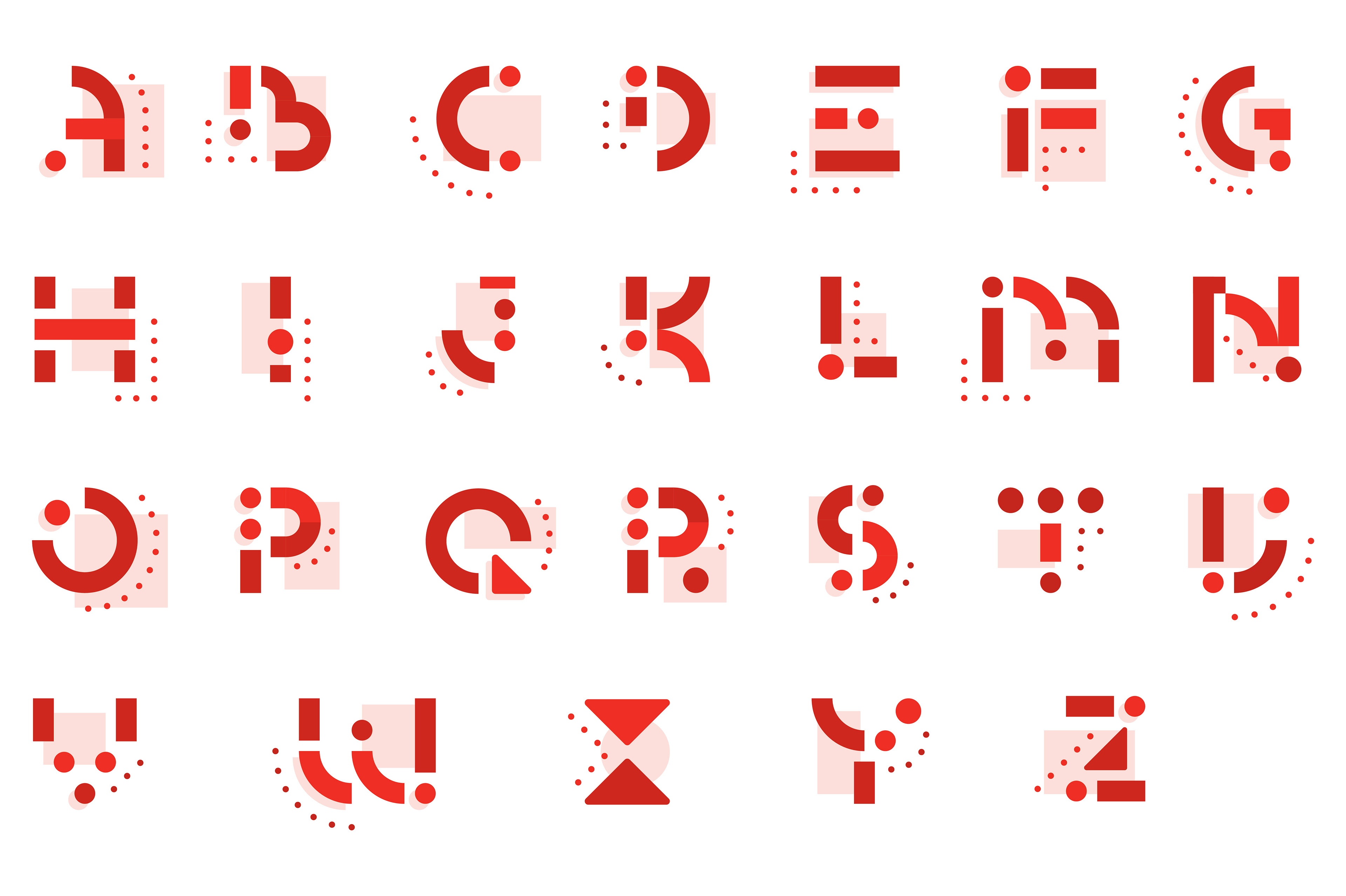
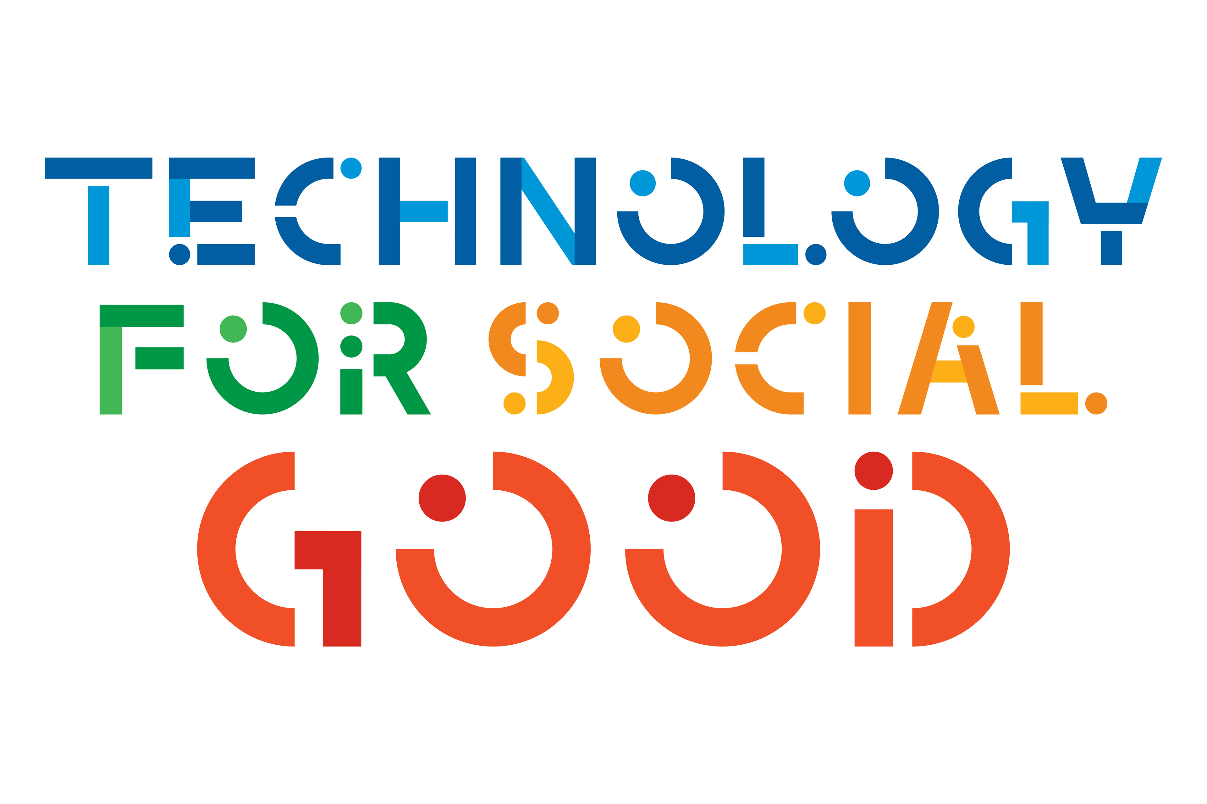


The Project
This was one of the exciting projects I did during my stint at Villains, as it was one of the very few opportunities to experiment with typefaces. 'Technology' being the at the core of the project afforded me a decent playing room in designing the typefaces. Adhering to the Google brand guides meant that we had to 'grow' the layouts from a white background. This was refreshing as there was a nice balance between playing with conservative layouts, and ones that allow more playful flows in the pages.