
The Exhibit
Exhibit identity
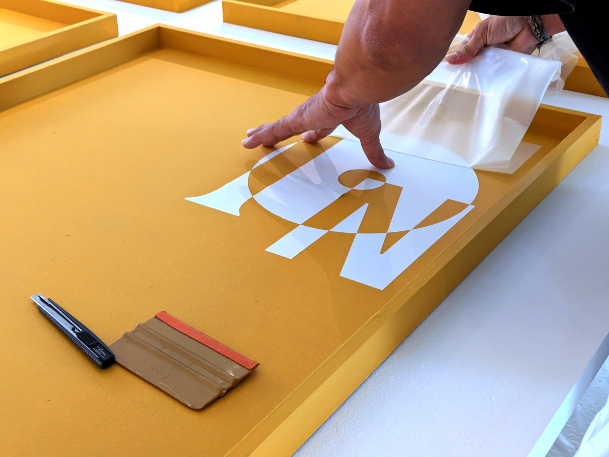
Identity wall projection placement
Exhibit visual centrepiece
Centrepiece wall projection placement
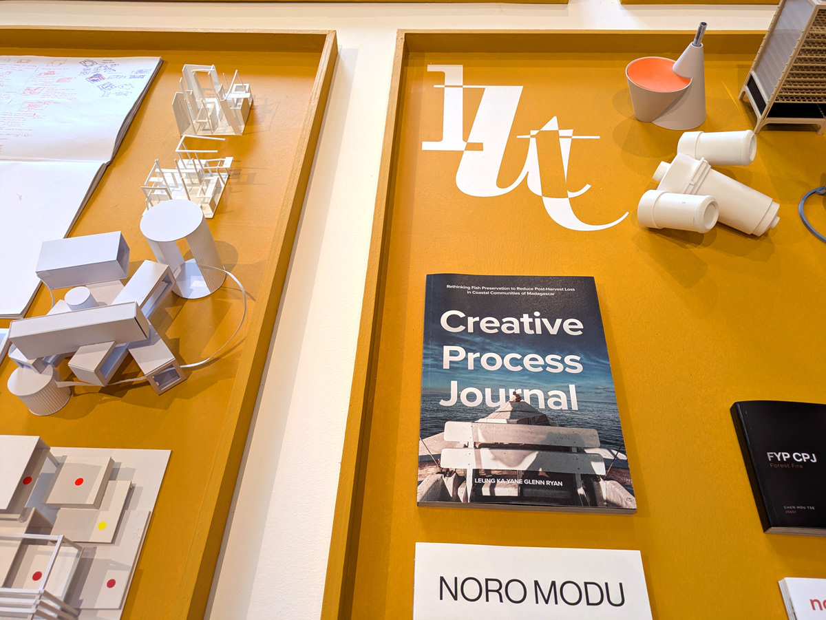
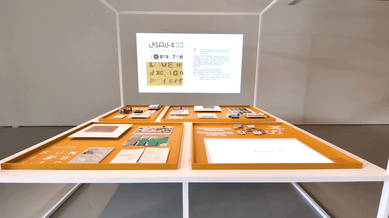
For The Love Of Design Process, is a component of the LASALLE 2026 Show. It is a curation of selected creative process journals from students across the design schools.
This project was another collaboration with Nur, the Dean of Design, and Jay, the Programme Leader of the School of Spatial & Product Design. Having worked with them on previous projects, we already shared a mutual understanding of each other's working styles and expectations. This allowed the process to progress smoothly and made it an enjoyable experience.
Nur envisioned an exhibit that invites the viewer into the intricacies of the design process. Too often we encounter the finished artefacts, overlooking the nuances behind each decision made and the exploration needed before arriving at the final outcome. Jay took the lead in the spatial design and curatorial arrangement of the artefacts, and I was tasked with designing the exhibit's identity and visual language.
DESIGNING THE VISUAL LANGUAGe
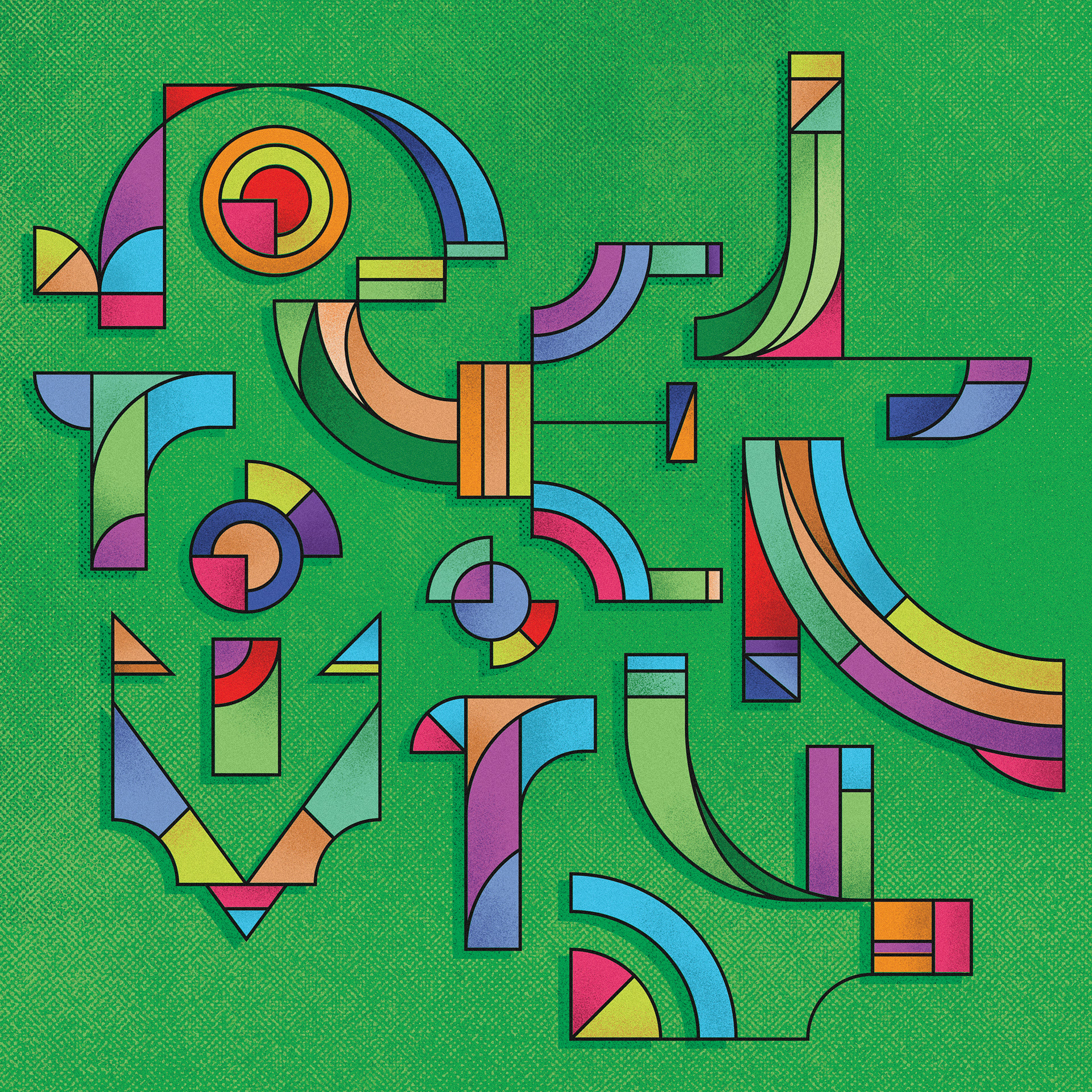
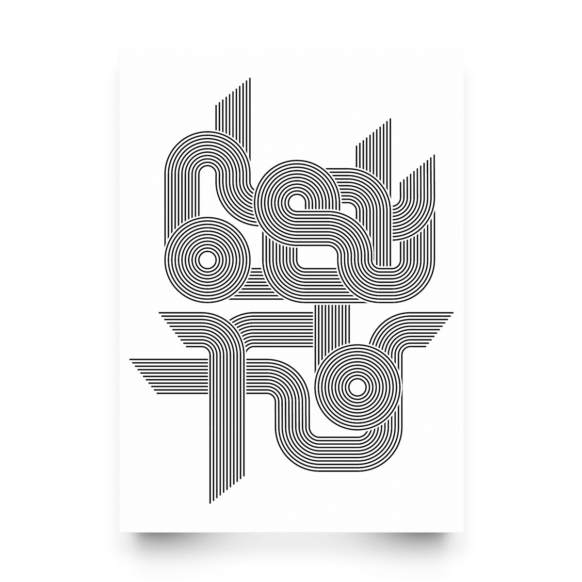
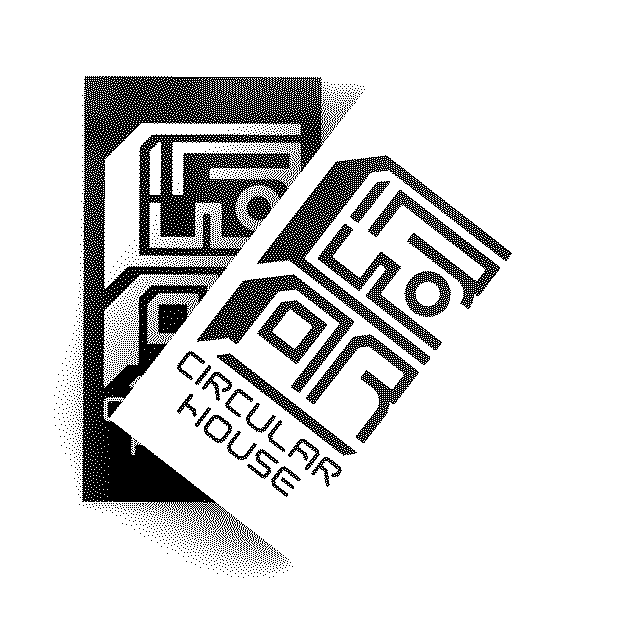
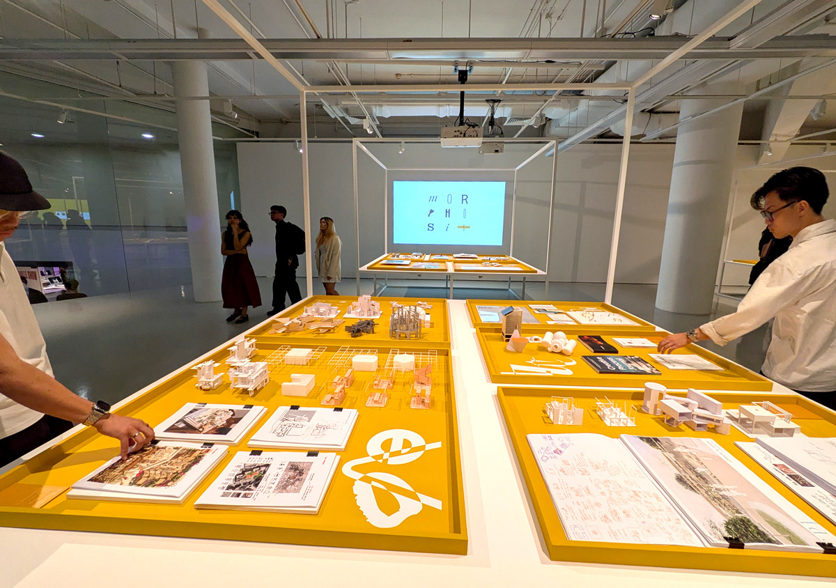
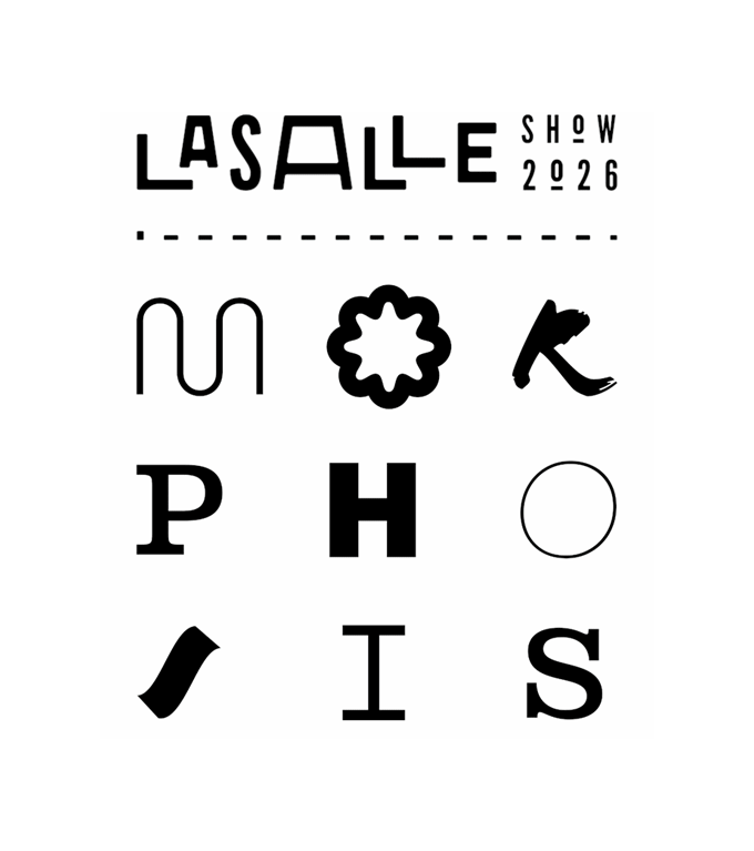
The chosen idea speaks of how the design process reflects the stages of morphosis. Kickstarting the art direction is a typographic execution of that word.
The word morphosis is arranged in a 3x3 grid. This references the foundational structure of every project, the blueprint. And for graphic designers, the grid system itself.
This art direction is designed on a dynamic interplay of multiple typefaces. The morphing of these alphabets symbolises transformation. This anchors the visual language designed for the exhibit.
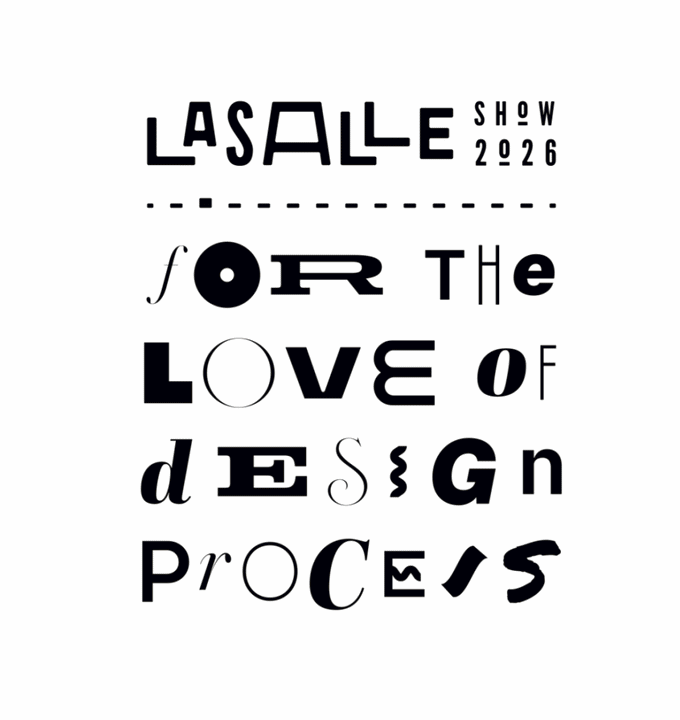
As we progressed, a clearer message, For the Love of Design Process, was used.
Setting the art direction
Applying the art direction to the updated title
Section Titles
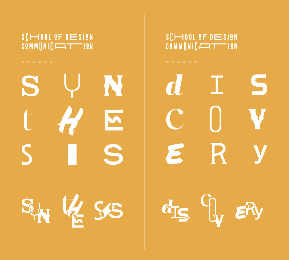
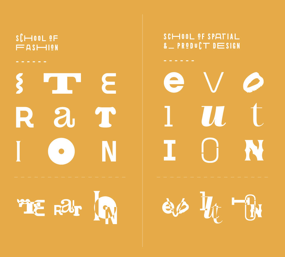
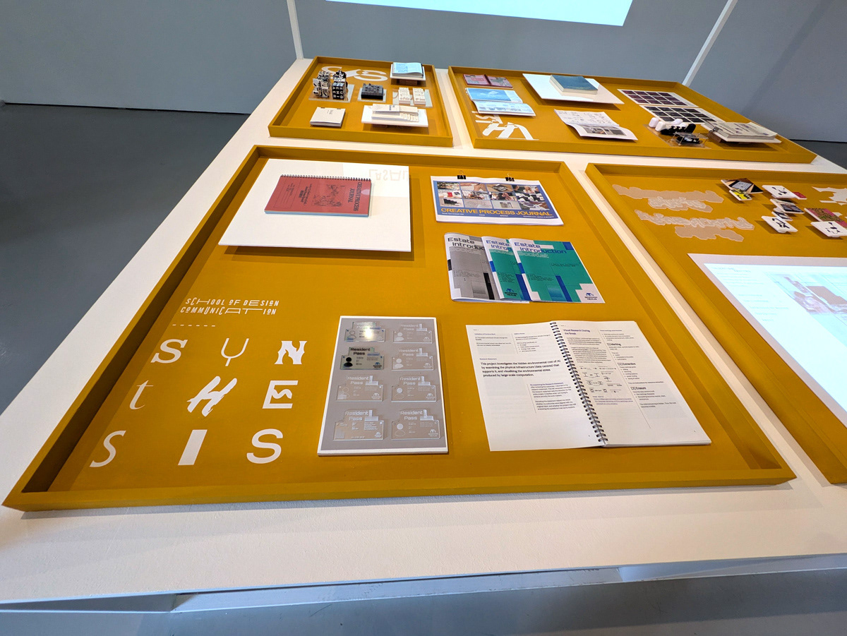
The exhibition is organised around the four design programmes. Each programme is titled after a hypothesised stage in the design morphosis:
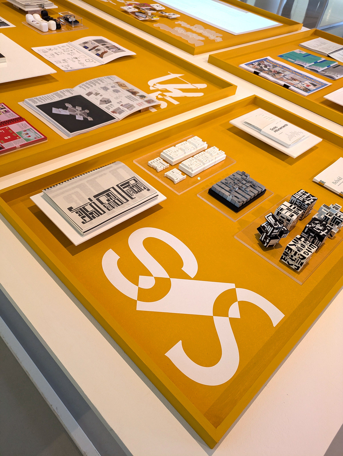
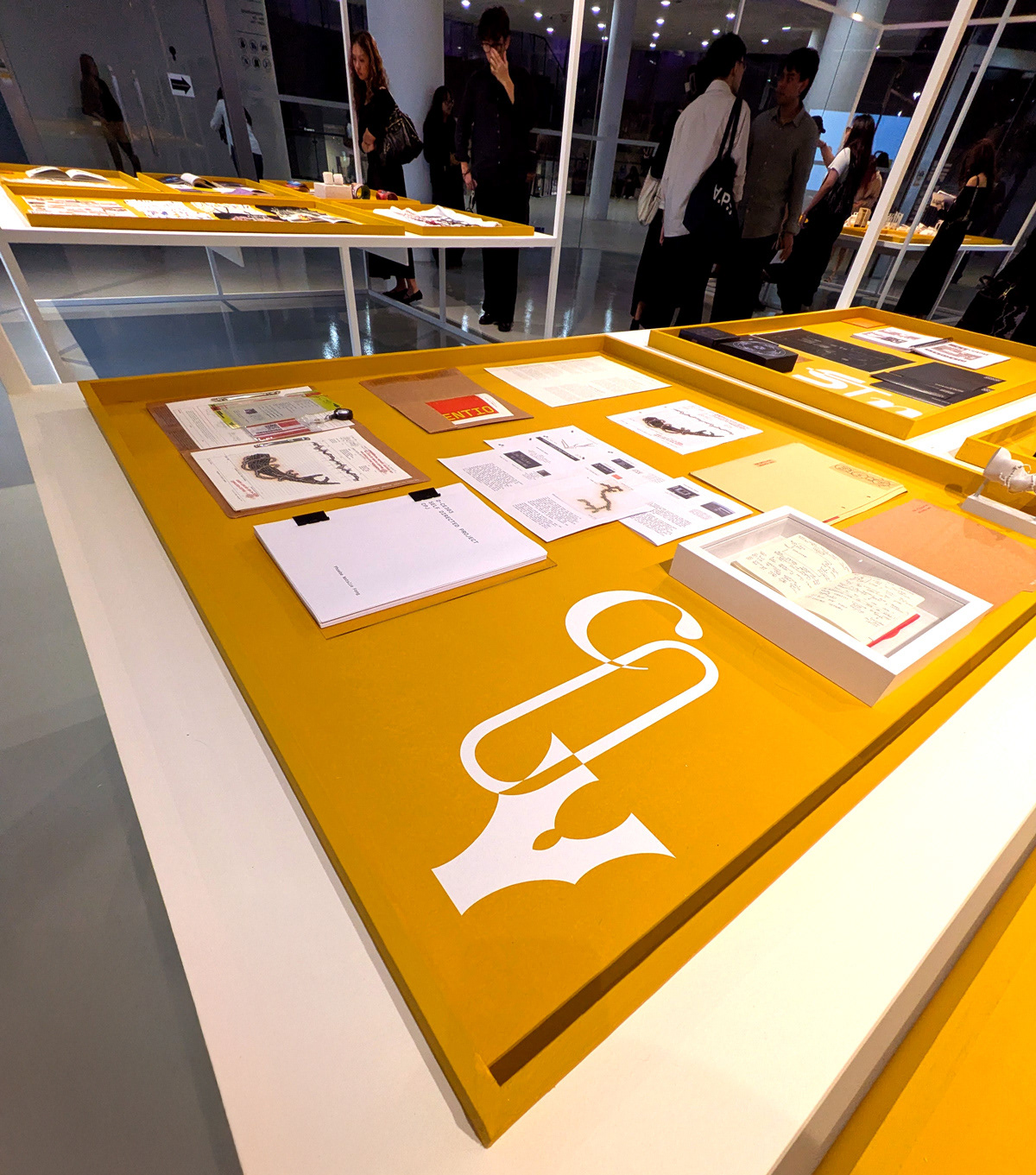
BA (Hons) Design Communication — Synthesis
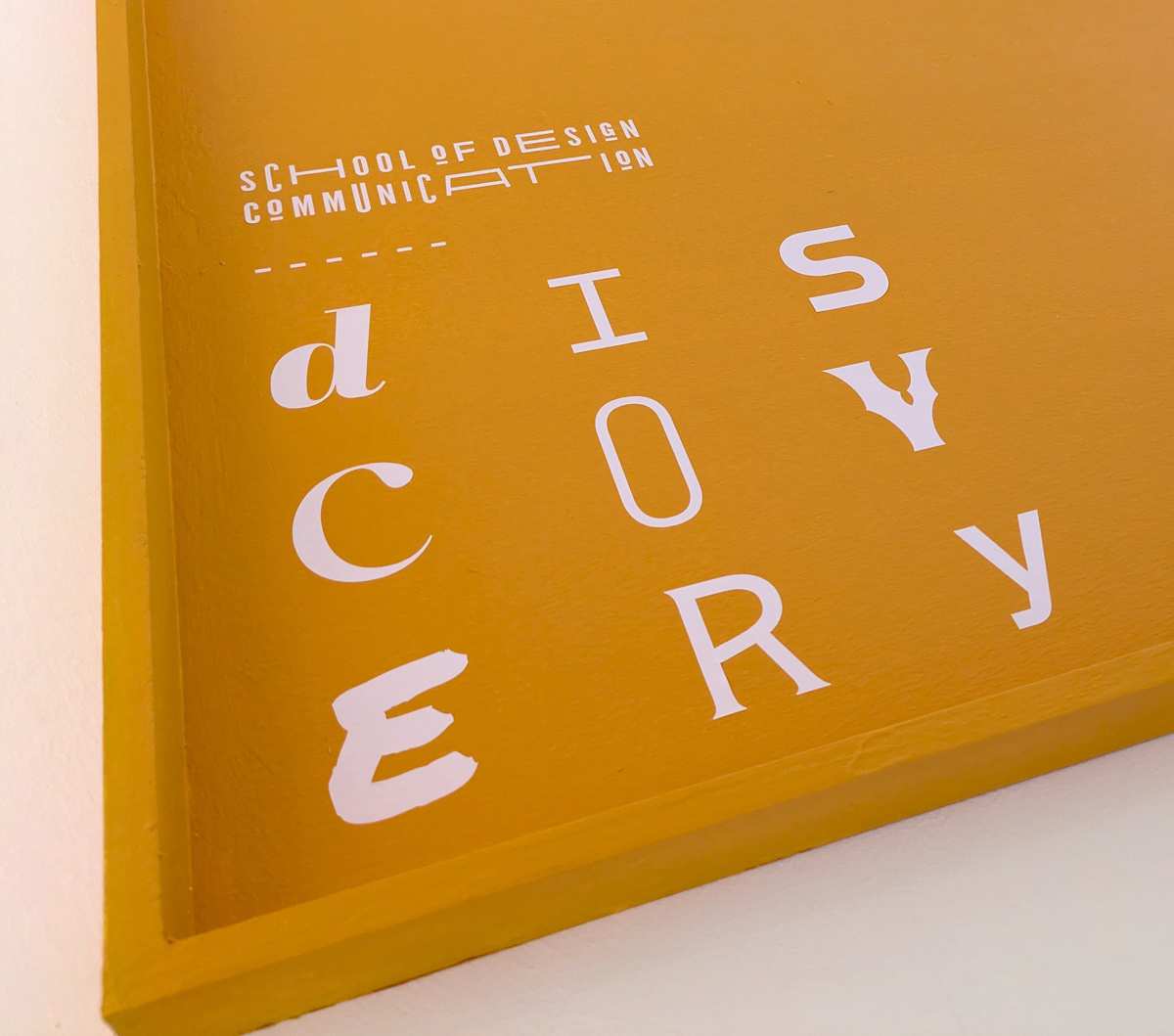
Diploma in Design for Communication and Experiences — Discovery
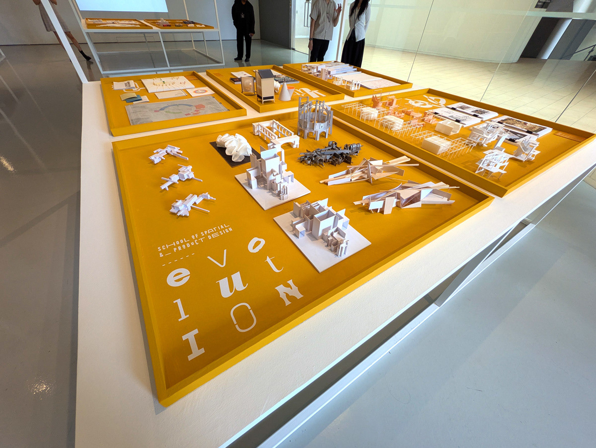
School of Spatial & Product Design — Evolution
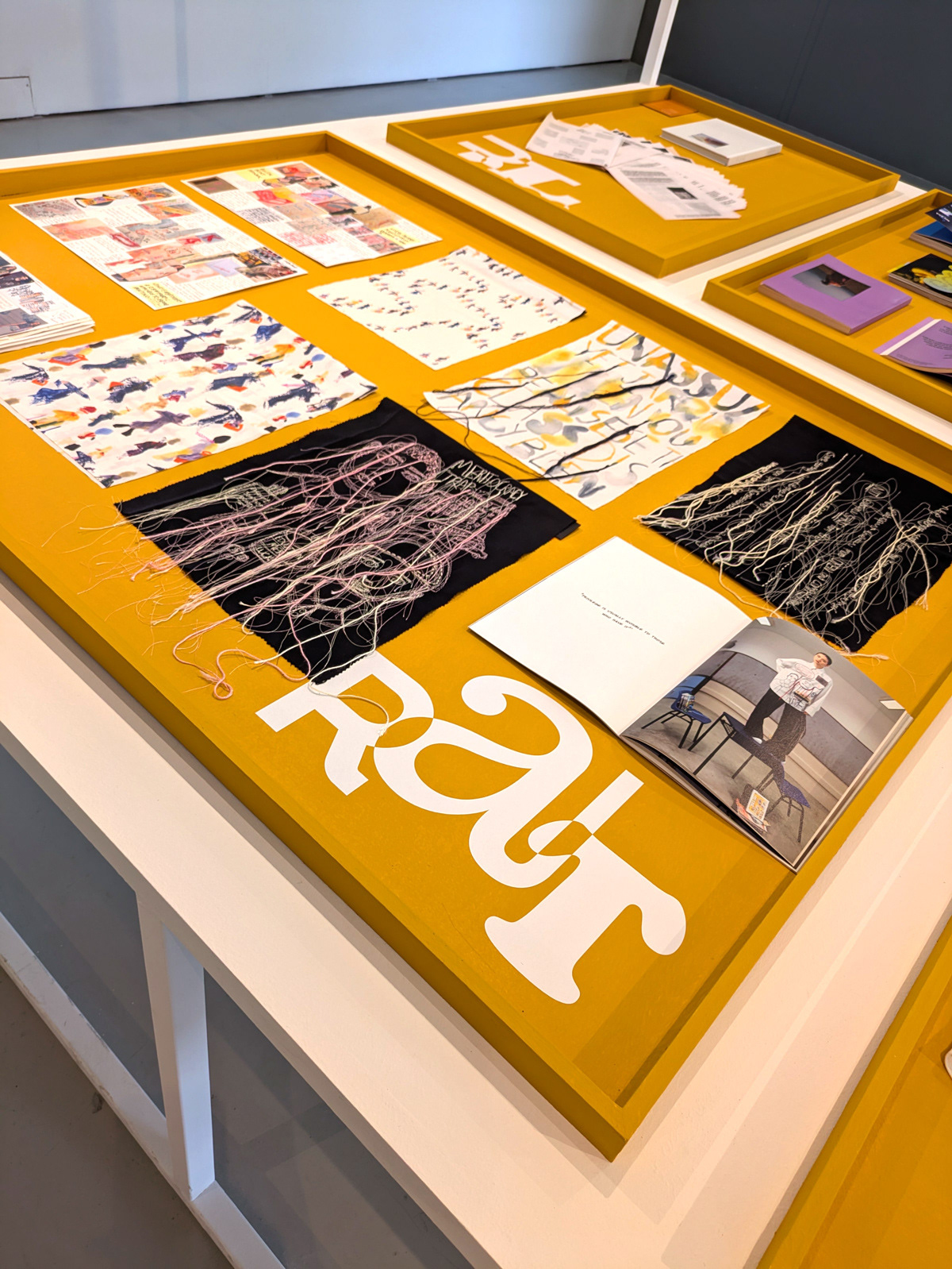
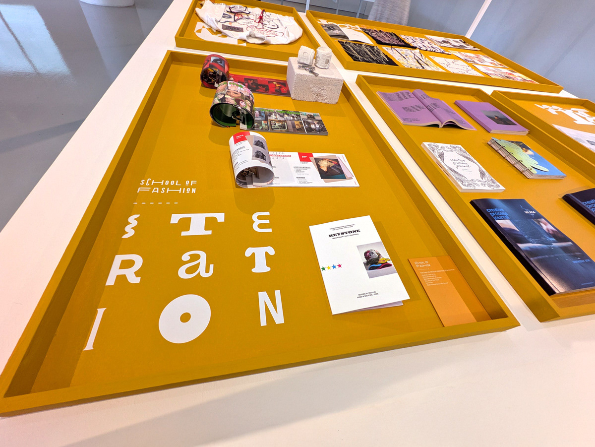
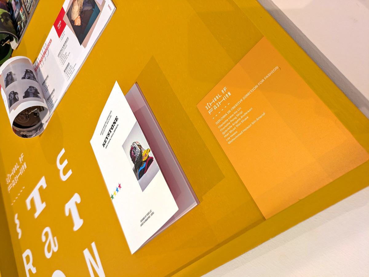
School of Fashion — Iteration
Diploma in Design for Communication and Experiences — Discovery
School of Spatial & Product Design — Evolution
School of Fashion — Iteration
These stages do not serve as descriptors of the programmes themselves. They function as thematic section headers that establish a consistent visual language across the exhibition.

A stage title (Synthesis) simulating a freeze-frame mid-morph
Extending the exhibition’s visual language, the stage titles are developed as static typographic compositions for application on plinths. They simulate a freeze-frame of letters mid-morph to maintain continuity with the motion work.