
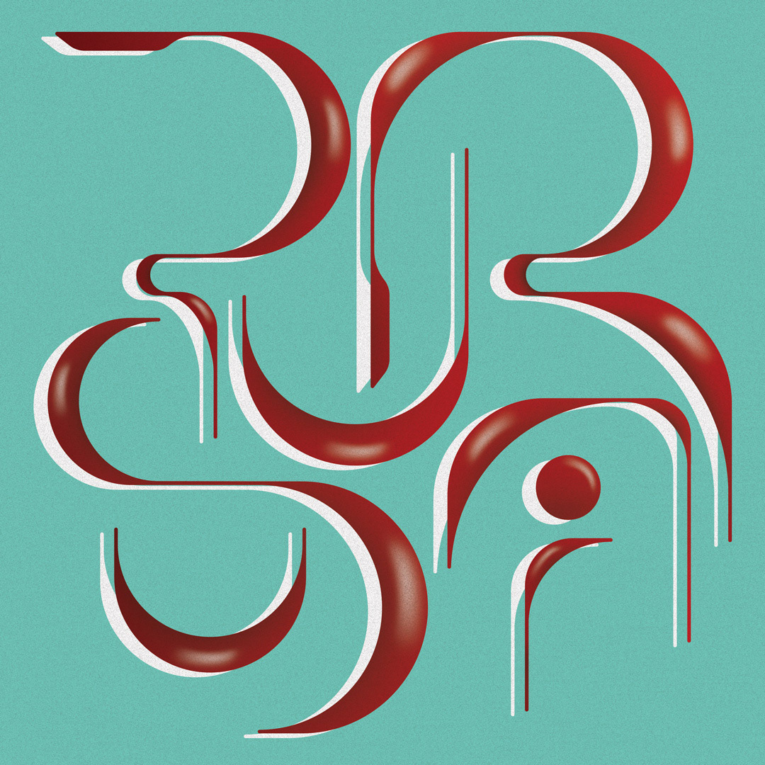
The Project
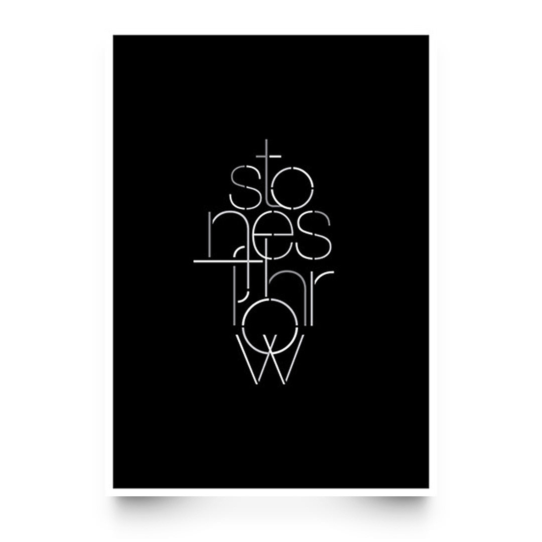
I'd often get myself involved in type experiments where I'd pick a word which resonated with my thoughts at that moment in time. For this graphic, the word 'pursuit' was chosen as probably a reminder of the importance to stay the course.
I wanted to improve on my previous approaches where the typefaces were often flat. Adding to the fluid aesthetic, I played around with gradients and some shading to add volume to the typeface.